Best Choice
Typeset
Hey, want to turn your ideas into a beautiful ebook fast? Typeset helps you write, design, and publish in one spot—no tech stress, just your words looking amazing everywhere.
Best for Marketers
Best for Creatives
Canva
Want to create an eBook that actually looks amazing? Canva makes it super easy — just drag, drop, and design like a pro without needing any design skills.
Friend to friend: a few links are affiliate links. When you purchase, I might get a tiny thank-you from the company, with zero added cost to you. I only recommend things that I’ve actually tried and looked into. Nothing here is financial advice; it is for entertainment. Read the full affiliate disclosure and privacy policy.
Start with numbers, not noise: landing pages convert around 6.6% on median, while popups add ~4–11% when timed well. Build for phones first, then cut form friction. Tag the PDF so everyone can use it.
You are aiming for steady, compounding wins. Keep one promise, one action, and one clear path from ebook to email to affiliate click. Put the benefit and button in the first screen on mobile, minimize fields, and repeat the same CTA where it helps scanning.
Ship an accessible, tagged PDF so the file works for everyone and aligns with WCAG 2.2. Treat benchmarks as baselines, not guarantees, and test one change at a time so you can attribute improvements.
This guide gives you simple rules, checklists, and examples so a small team can launch in hours, not weeks—no code, no complex tooling, just focused execution supported by evidence.

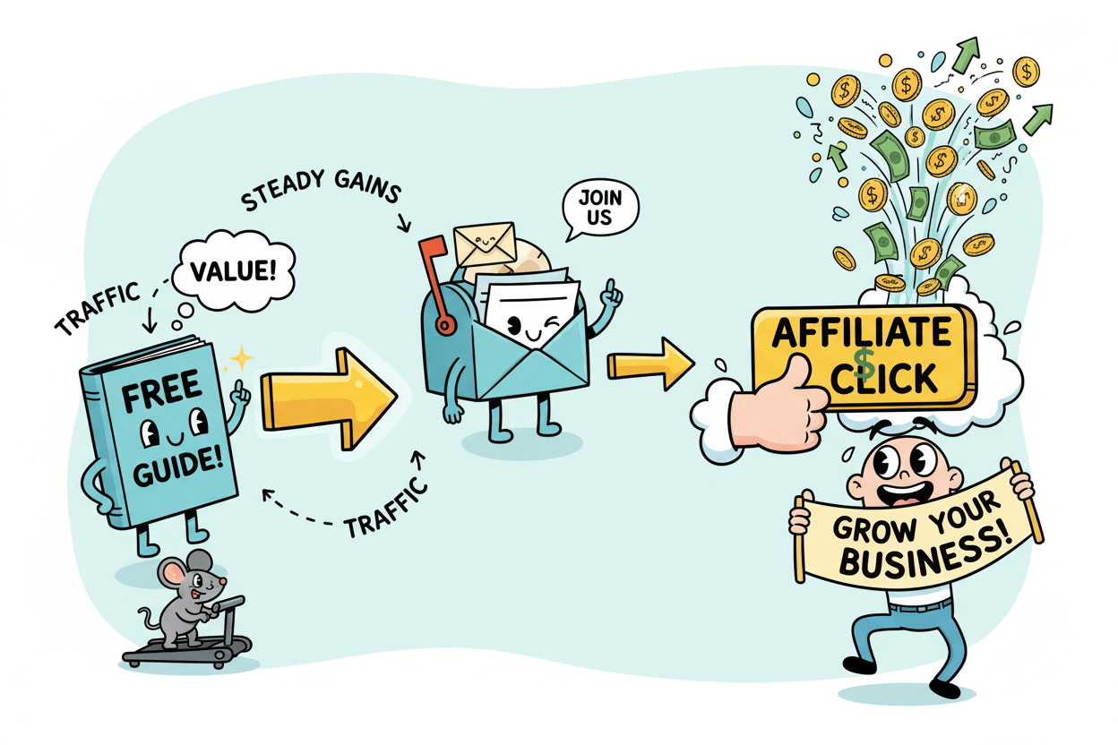
The fast path: ebook → email → affiliate click
Your ebook moves people one clear step at a time. A visitor sees value, claims the download, joins your list, and meets a helpful product that solves the same problem. Keep the path simple and measurable.
Two gates decide momentum: the landing page and the email capture moment. Treat your numbers as signals, then tune the design for steady gains.
Benchmarks that set the floor, not the ceiling
Aim with realism so your wins feel earned. A practical baseline for landing pages is about 6.6% conversion across industries. This is a starting line, not a finish line. Traffic quality, offer specificity, and page clarity shift results.
Choose one primary promise for the ebook and let every element support it. Write a title that names the outcome. Add a single-line benefit that removes doubt.
Use three short proof points that show credibility without strain. Place a bold button that states the action. Measure weekly, then stack small improvements.
Helpful checklist:
- One promise, one action.
- Benefit and button visible in the first screen on mobile.
- Three proof points, short and concrete.
- Visual preview of the ebook to raise perceived value.
- Clear privacy note near the form.
Where popups help and when to skip them
Popups earn attention when the timing and message respect context. Average performance ranges from about 4% to 11%, depending on trigger, device, and audience. Use popups to surface the same core offer in the moment a visitor is ready.
Timed or scroll-based prompts suit mobile screens. Exit-intent suits desktop sessions that linger. Multistep prompts can feel lighter: ask for the email first, then offer optional tags to shape follow-up content.
Design principles for higher lift:
- Match the popup headline to the page promise.
- Keep the form to name and email by default.
- Use a single, specific CTA like Get the 7-step checklist now.
- Cap frequency so visitors see value without fatigue.
- Repeat the offer after proof blocks for a second chance to say yes.
Fast optimization plan:
- Establish your current page conversion and list the traffic sources.
- Ship a mobile-first hero with benefit, proof, and button visible immediately.
- Add one popup variant aligned to the same promise.
- Measure for seven days. Adjust timing, copy, or fields one at a time.
- Keep what lifts the baseline. Archive the rest for learning.
With this path set, you turn attention into action and action into revenue—calmly, step by step.
Design rules that earn the download
Design for the skim. Your ebook must signal value in seconds. Think clear promise, sharp visuals, and generous spacing. Build for phones first. Every element earns its place. Keep one goal in view: earn the tap on “Download.”
Cover heuristics that signal value
Your cover is the billboard. Make it specific.
- Title = outcome. Name the result the reader gets, not the topic.
- Subtitle = clarity. Add a short phrase that narrows scope and audience.
- Single focal image. Pick one strong visual that reinforces the promise.
- Readable type. Large title, steady hierarchy, high contrast, no thin fonts.
- Brand cues. Consistent colors and logo placement in a quiet corner.
- Three proof cues. Small badges or lines like “Step-by-step,” “Template inside,” “10-minute setup.”
- Whitespace. Space creates calm. Tight covers feel cheap.
Quick checks:
- Squint test on a phone. Title must read at arm’s length.
- Color test in grayscale. Contrast should still hold.
- Crop test. If edges crop on thumbnails, the title remains intact.
First-screen structure that moves the eye
Your first screen sells the click. Show the promise, a glimpse inside, and a clear next step.
- Hero block. Title, one-line benefit, and a crisp ebook mockup.
- Proof bullets. Three bullets that point to outcomes or time saved.
- Primary CTA. Action + outcome + timeframe. Example: “Get the 7-step checklist now.”
- Privacy microcopy. A short reassurance near the form. Example: “Free. Unsubscribe anytime.”
- Scan-friendly layout. Big headings, 1.4–1.6 line spacing, comfortable margins.
- Thumb-friendly tap targets. Buttons at least the width of a thumb. Plenty of padding.
- Load-first assets. Compressed hero image and system fonts for speed.
Microcopy patterns:
- Headline: “Design an ebook that wins downloads”
- Subhead: “Follow a simple 7-step layout that works on phones”
- Bullets: “Cover formula for clarity,” “CTA lines you can copy,” “Tagged PDF checklist inside”
- Button: “Download and start in 10 minutes”
Common polish:
- Add a subtle shadow around the mockup to lift it from the background.
- Align left on mobile. Center sparingly for short headlines only.
- Repeat the CTA after the bullets and again after a short preview image.
Before you move on, read the screen aloud. Every word should push toward the download. If it does not, cut it.
Landing page elements that convert in 2025
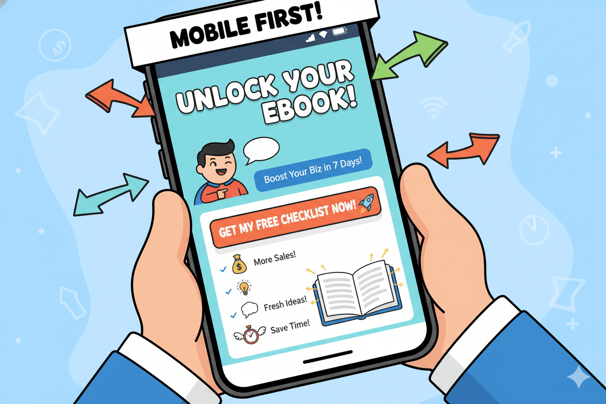
Your page sells the download. Build it for phones first and surface value plus action in the first screen. Core blocks that win today: hero with title and image, one-line benefit, 3–5 proof bullets, visual preview, brief author bio, concise FAQ, and one primary CTA.
Shopify’s 2025 guide and Unbounce’s examples show this pattern repeatedly. Keep the CTA visible early and repeat it after proof.
Mobile is the majority context. Design the first viewport to carry the decision. Statcounter shows mobile at ~57–58% of global traffic in September 2025. That makes above-the-fold clarity non-negotiable.
Unbounce’s best-practice notes: put headline, value prop, and CTA where users see them immediately without cramming the screen. Balance visibility with breathing room so the button remains obvious.
Use a single action. Split focus costs conversions. Your CTA copy should combine action + outcome + timeframe, e.g., “Get the 7-step checklist now.” Keep navigation minimal, avoid competing offers, and align the page promise with the ebook cover and popup headline.
Contemporary swipe files from Shopify and Unbounce reinforce this singular-action structure.
Above-the-fold essentials for phones
Show the promise, proof, and button without scrolling. Compose a tight hero: outcome-based headline, one-line benefit, and a clean mockup of the ebook. Place a large CTA with generous padding and clear contrast.
Then add 3–5 bullets that preview results or time saved. Unbounce advises keeping USP and CTA highly visible; design for the devices your audience actually uses. Use system fonts and compressed images for faster paint.
Repeat the CTA after the bullets and again after the preview image.
Proof blocks and microcopy that lower risk
People hesitate when effort or uncertainty feels high. Reduce both. Add a short author bio or brand line, one or two credible logos or testimonials, and a tiny privacy note near the form. Keep forms minimal; Baymard’s research shows fewer fields reduce friction.
For segmentation, stage optional questions after email in a multistep flow. Use microcopy to remove doubts: “Free download,” “No spam,” “Unsubscribe anytime.” Maintain one CTA. Pattern libraries from Shopify and Unbounce illustrate these proof and reassurance placements.
Checklist to finalize the page:
- One page, one action.
- Headline, benefit, CTA visible in screen one.
- Visual preview plus 3–5 outcome bullets.
- Minimal form fields by default.
- Proof snippets and a short privacy note.
- CTA repeated after proof and near the footer.
Design for the scrolling reality of 2025, but win the decision in the first screen.
Form friction: exact fields to keep or cut
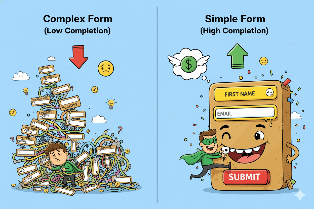
Less input lifts completion. Start with name + email only. Add anything else only if it changes delivery or follow-up. Large UX studies show most sites can cut 20–60% of fields without losing needed data, and that perceived complexity is the core dropout driver.
Make every field earn its place. If you need qualifiers, stage them. Capture the email first, then ask optional questions on a second step or on the thank-you page. Multistep opt-ins are often perceived lighter and can outperform single-step forms when aligned to context.
Use benchmarks to stay honest. Cross-industry form datasets show wide variation by type and intent, so treat numbers as ranges, not promises. Monitor completion rate, time to complete, and field re-entries to spot friction.
Keep by default
- First name (optional) and email.
- One primary CTA.
- Short privacy note near the button.
Add only when justified
- Goal-critical qualifiers (e.g., role, company size) placed after email.
- Country or region if required for compliance or delivery.
- Consent checkboxes only when legally necessary.
Friction reducers
- Inline labels or clear placeholders that persist on focus.
- Mobile-friendly inputs and autocapitalize rules.
- Error messages that say how to fix, not just what failed.
- Autofill support and sane defaults.
Track the signals. If people abandon the same field or frequently re-enter, simplify or defer it. Industry panels show strong differences by form type, so compare your asset to similar forms, not to generic averages.
The two-field default and when to ask for more
Lead with the promise and keep the form short. Baymard’s multi-year checkout research finds many sites ask for more than they need and could remove 3–4 fields on average; fewer fields cut cognitive load and speed completion.
For lead magnets, the two-field start is the safe default. Add more only if it unlocks segmentation you will actually use.
Good reasons to add a field
- You personalize the follow-up sequence differently by role or goal.
- Legal or delivery needs require location or consent.
- You run a later offer that depends on a qualifier collected post-email.
Multistep prompts that feel lighter
Break the decision into yes → details. Ask for email on step one with a clear value reminder. On step two, offer optional tags like “beginner/advanced” or “industry.”
Vendors report multistep popups can capture more leads when steps are short and contextual; test against your baseline to confirm.
Micro-pattern
- Step 1: “Get the 7-step checklist now” + email field + privacy note.
- Step 2 (optional): “Help us tailor tips” + 1–2 toggles.
- Success: deliver download, set expectations for next email.
Always measure against your own funnel. Use Zuko-style metrics—completion rate, time, and corrections—to decide if fewer fields or staged steps move the needle.
Affiliate-ready CTA patterns and examples
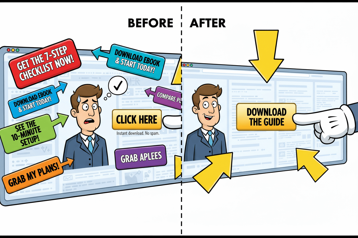
Your button copy carries the click. Keep one primary action per page. Write CTAs with action + outcome + timeframe so the next step feels obvious: “Get the 7-step checklist now,” “See the tools I recommend,” “Start the 10-minute setup.”
Research-backed guidance favors short, verb-led labels and microcopy that reduces doubt near the button.
Use repetition with intent. Place the same CTA where it helps the scan: first screen, after proof, and near the footer. Leading examples show repeated, consistent CTAs raise clarity and keep the next step within thumb reach on mobile.
Pair each button with a small risk reducer like “Free” or “No spam.”
Match CTA language to the page promise. If your headline promises a fast win, echo that speed in the button.
If your offer is a download, say “Download the guide,” not “Submit.” Examples libraries from Unbounce and HubSpot show that specific, benefit-tied phrasing beats generic labels.
Download CTAs that set up the affiliate click
Write for intent, not cleverness. Swipe these patterns and adapt:
- Get the 7-step checklist now
- Download the ebook and start today
- See the setup that takes 10 minutes
- Grab the templates I use
Keep one CTA per page. Use supporting microcopy to answer the silent question: “What happens next?” For example: “Instant download. No spam.” Shopify’s ebook landing examples reinforce a single, prominent CTA above the fold with proof blocks below.
Placement rules of thumb:
- First screen: primary CTA with outcome.
- After bullets: repeat the same label.
- Near footer: repeat again for scrollers.
Unbounce’s example analyses highlight this consistent placement and copy matching across high-converting pages.
Post-download CTAs inside the ebook
Your ebook should gently lead to your recommended tool. Use section-end prompts that connect the lesson to the solution:
- Try the tool I used in Step 3
- See my settings for this workflow
- Compare plans and pick the starter option
Keep labels short and concrete. NN/g’s microcopy guidance: inform, influence, and help the user interact. Tie each button to a next action the reader expects after the lesson. Add a brief reassurance below if the click leads off-site, like “Opens the tool site in a new tab.”
Implementation checklist:
- Verb-first label that names the outcome.
- One primary CTA per page.
- Consistent wording across repeats.
- Tiny risk reducer under the button.
- Mobile-first sizing and spacing for tap targets.
Use trusted swipe files for inspiration, then test variants—small wording shifts can move clicks.
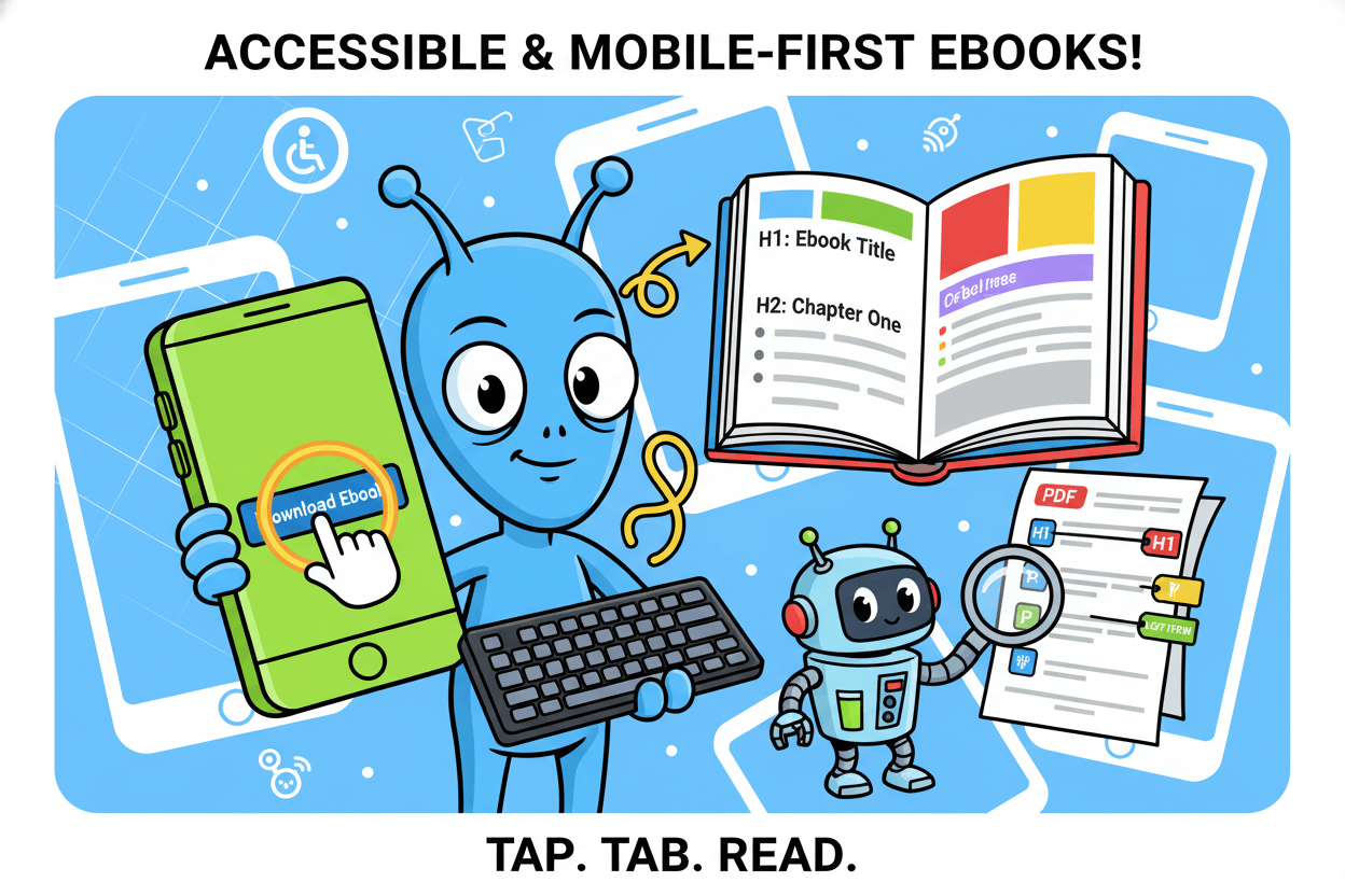
Ship an accessible, mobile-first ebook and page
Design for phones first and for keyboard users always. Most traffic is mobile, so show value and a tappable CTA in the first screen. Then confirm the page and the PDF meet WCAG 2.2 and Section 508 basics. Mobile-first improves reach; accessible design prevents blockers.
Focus indicators, headings, and contrast
Make keyboard focus obvious. WCAG 2.2 requires a visible focus indicator; the new Focus Appearance criterion defines minimum size and contrast so users can track focus as they tab.
Keep a clear ring or underline that stands out from the background and stays visible when components are focused. Pair with readable headings and sufficient color contrast across states.
Implement the basics:
- Always show a visible focus style on interactive elements.
- Ensure the focus style meets size and contrast thresholds.
- Prevent overlays or sticky bars from obscuring focus.
- Use a clean H1–H3 hierarchy so assistive tech and skimmers can navigate quickly.
These steps align with WCAG 2.2 guidance and its quick reference, which details focus behavior and contrast thresholds.
Tagged-PDF export steps and checks
Ship a tagged PDF so screen readers can parse structure and reading order. Tag the document root, apply heading tags to titles and sections, mark lists and tables correctly, add alt text to figures, and artifact decorative images.
Verify tab and reading order before release. Section508’s author guides and W3C’s PDF techniques cover these exact steps.
Practical workflow:
- Author in your tool of choice using real styles for headings and lists.
- Export to PDF with “Create tagged PDF” enabled.
- In Acrobat or equivalent, confirm the Tags tree: Document → H1/H2 → P/List/Table.
- Set figure alt text; mark decorative images as artifacts.
- Fix the Reading Order and Tab Order where needed.
- Re-run an accessibility check, then spot-test with a screen reader.
For legacy documents, agencies document common remediation steps. Use these only when re-authoring isn’t feasible; clean source files produce better results.
Mobile-first touch-ups for the page:
- Keep the first viewport lean: headline, one-line benefit, CTA, and visible focus style.
- Use large tap targets and spacing so the focus ring remains clear on mobile.
- Avoid fixed elements that hide focused controls.
These changes align your landing page with WCAG expectations and help users who navigate without a mouse.
Bottom line: visible focus on the page and a correctly tagged PDF in the download are non-negotiable. They expand your audience and reduce friction at the exact moment a visitor decides to say yes.
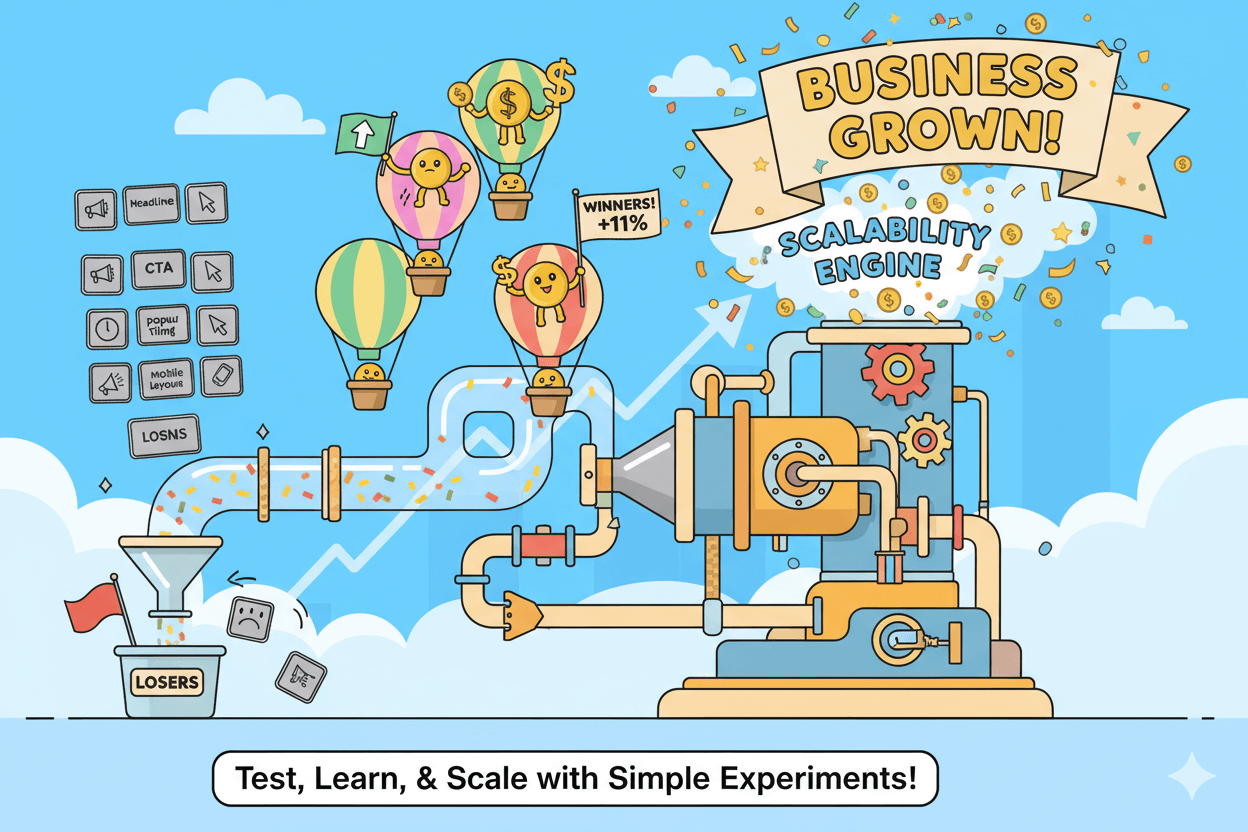
Test, learn, and scale with simple experiments
Small tests compound. Work one variable at a time, measure against a realistic baseline, then keep what lifts. Use 6.6% as your broad landing-page median, and treat popup performance as a range that depends on trigger, device, and offer.
Choose the right levers.
Start where friction is highest or traffic is largest. Good first tests: headline clarity, CTA copy, popup trigger and timing, field count, and mobile first-screen layout. Respect single-variable discipline so you can attribute gains.
Know the terrain.
Vendor datasets show different averages. Wisepops reports ~4.65% mean popup CVR and higher lift on mobile campaigns; OptiMonk cites ~11.09% across its network. Sleeknote’s 2025 study sees ~4.68% for centered popups.
Use these as directional ranges, not promises, and always compare your variant to your control.
7-day micro-cadence
- Day 1: Baseline. Log page CVR, popup CVR by device, and form completion. Record traffic sources.
- Day 2: Headline clarity. Rewrite to name the outcome. No other changes. Measure page CVR deltas.
- Day 3: CTA copy. Test action + outcome + timeframe on the button. Track click-through to form.
- Day 4: Popup trigger. Compare on-landing vs on-scroll vs exit. Wisepops data shows meaningful spread by trigger.
- Day 5: Field count. Two-field control vs multistep variant that asks email first, segments second.
- Day 6: Mobile first screen. Recompose the hero so promise + CTA appear without scrolling. Recheck mobile CVR.
- Day 7: Review. Keep winners. Archive losers with notes. Queue the next variable.
Guardrails that prevent false wins
- Run tests long enough to reach a reliable sample before calling winners. Segment by device when possible.
- Cap popup frequency and keep one primary action to protect user experience and clarity.
- Validate “improvements” hold across your largest traffic sources, not just a niche slice.
Reading the numbers
If your page sits near the 6–7% median and popups add ~4–11% on eligible sessions, your funnel is healthy. Under those ranges, prioritize clarity and first-screen value; over them, explore advanced triggers and segmented follow-ups.
Your data is the source of truth. Industry reports set the floor. Your tests build the ceiling.
Conclusion
You win with simple, proven steps. Design an ebook that promises one clear outcome. Ship a landing page that shows the benefit and a bold CTA in the first screen. Use the median 6.6% landing-page CVR as a baseline, not a guarantee.
Layer popups for incremental lift and measure by device. Treat vendor ranges as directional data, not targets. Then iterate with single-variable tests.
Build for phones first. Most sessions are mobile, so your hero, proof bullets, and CTA must be thumb-easy. Keep one action per page. Minimize form fields to name + email, then stage any qualifiers. Repeat the same CTA after proof and near the footer.
Track page CVR, popup CVR, and form completion. Compare variants against your control, not global averages.
Ship accessibly. Make focus states visible and strong per WCAG 2.2. Avoid elements that obscure focus. Export a tagged PDF with correct headings, alt text, and reading order so screen readers work. These steps widen reach and prevent avoidable drop-offs.
Final checklist: one promise, one action; mobile-first hero; two-field form; consistent CTA copy; visible focus; tagged PDF; weekly micro-tests.
Disclosure note: if you recommend tools, add a clear affiliate disclosure wherever the link appears. Then watch your path compound: ebook → email → affiliate click → sale.


