Friend to friend: a few links are affiliate links. When you purchase, I might get a tiny thank-you from the company, with zero added cost to you. I only recommend things that I’ve actually tried and looked into. Nothing here is financial advice; it is for entertainment. Read the full affiliate disclosure and privacy policy.
Viewers decide in a blink. Draft two or three clean Pikzels thumbnails, then let YouTube’s Test & Compare crown the winner on real traffic.
This guide shows how to turn that advice into a fast, beginner-friendly workflow with Pikzels 3.0.
You’ll create two to three clean variants in minutes using face swap for recognizability, high-contrast text treatments, and quick background adjustments, then A/B them in YouTube Studio to pick a winner with data.
Results vary by channel and audience volume, so you’ll lean on the platform’s own experiment readouts to know when a result is confident.
You will also see patterns for faceless channels, a refresh play for older videos with low CTR, and simple accessibility checks that keep thumbnails legible on mobile.
The goal is practical: ship professional thumbnails without design skills and prove they work with native testing.

Why Thumbnails Decide Clicks on YouTube
Your title talks. The thumbnail convinces. Keep one clear subject, big type, and strong contrast—then test it.
Your thumbnail also has to fit the system. The player and preview surfaces expect a wide 16:9 image, so design for small screens first, then check that text still pops at phone size.
quick_win: Before exporting, zoom to ~25–30% to mimic phone view. If text blurs or merges with the background, increase contrast or reduce words.
The fundamentals YouTube wants you to follow
Design around a single focal point. Choose expressive faces or clear action, then add short, legible text in a clean font. Keep layouts uncluttered so the message reads at a glance.
These are the platform’s own recommendations for thumbnails that stand out and earn clicks.
Mobile legibility and safe text sizing
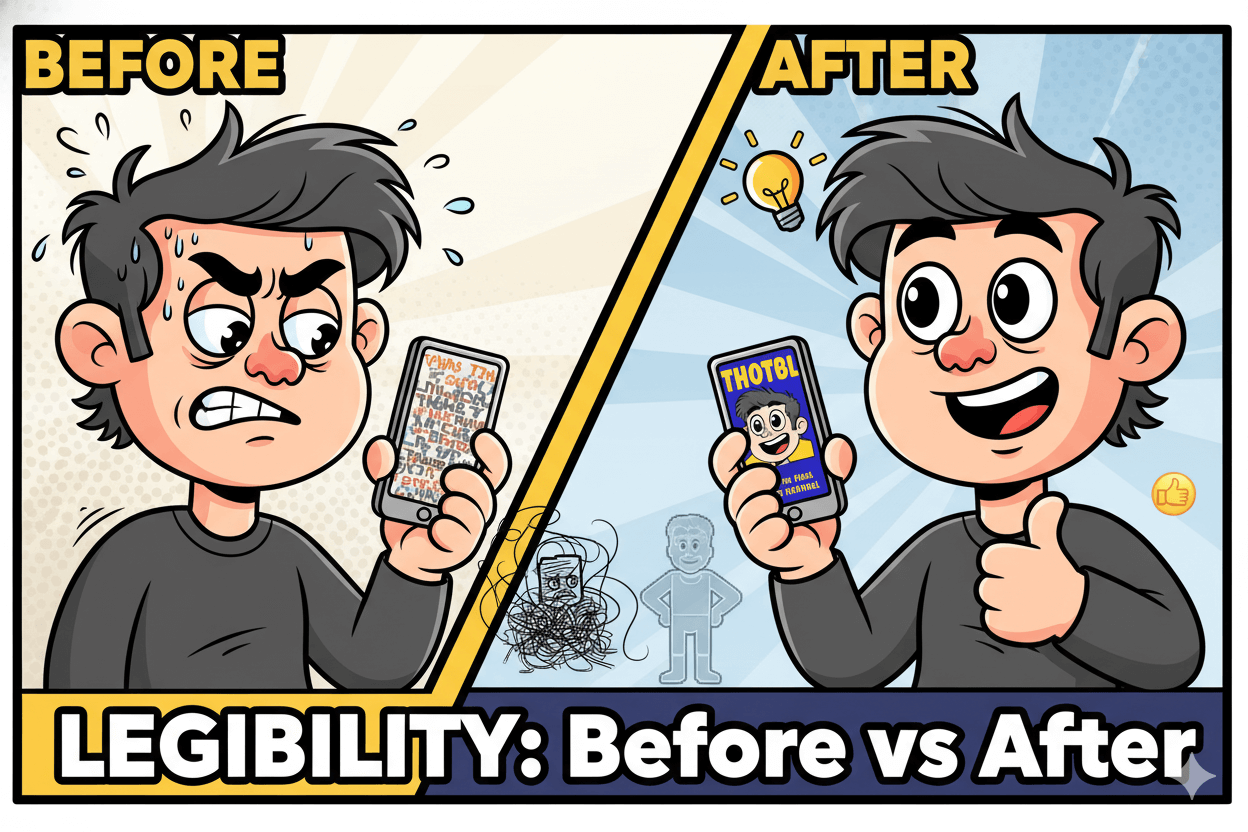
Assume viewers meet your video on a phone. Favor large, bold lettering with strong color separation from the background. Check a small preview to confirm readability; if you struggle to read three to five words, simplify.
Guides that simulate phone scale can help you validate legibility quickly.
File specs that prevent upload friction
Stay inside the technical rails: 1280 × 720 resolution, 16:9 aspect ratio, ≤2MB, and JPG/PNG/GIF formats. Following these specs keeps the image crisp after compression and avoids rejection on upload. Minimum width is 640 px if you must go smaller.
Pikzels 3.0 in Practice: From Idea to Three Variants in Minutes
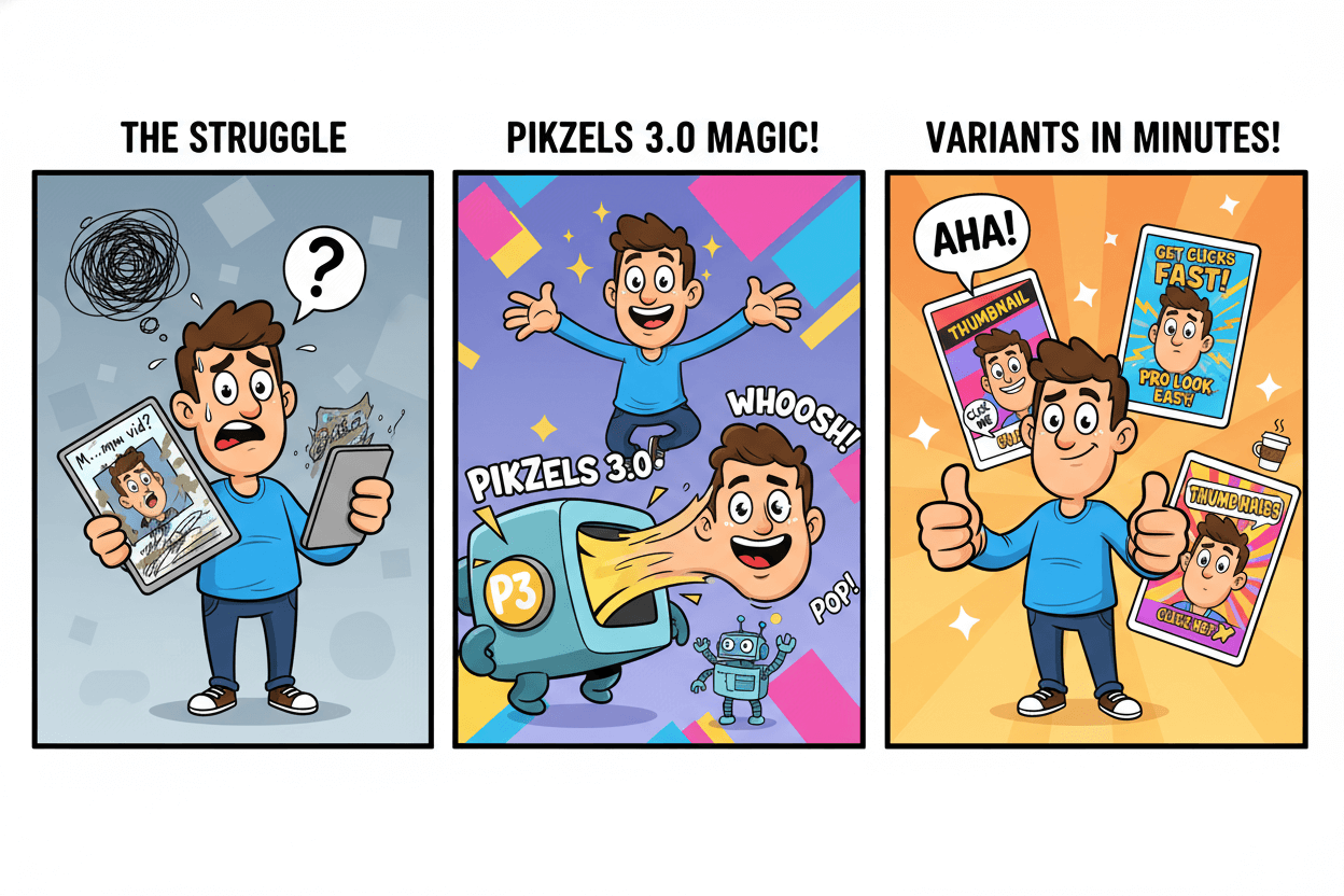
From idea to testable options fast. Pick a persona, face-swap, punch up text, export three strong variants.
before_after: Create one control thumbnail that follows YouTube’s clarity basics. Create two Pikzels variants that lean into stronger contrast or a tighter crop. Save all three for testing in Studio’s Test & Compare after this section.
Face swap for recognizability and brand consistency
Open your draft and select your persona. Pikzels lets you replace the generated face with your own so returning viewers recognize you instantly. Keep lighting and angle consistent across videos to build a visual signature.
Reviewers note face swap as a differentiator, with praise for speed and realism, though results can vary by image quality and pose.
Text pop and contrast checklist inside the editor
Short words win. Set a 3–5 word cap, then test high separation between text and background. If letters fade, swap background, add a simple shape, or invert colors.
Pikzels is optimized for YouTube layouts, so you can iterate quickly: regenerate, nudge font weight, reframe the subject, and export at the platform’s standard size. Keep each variant readable at a small preview before you hit download.
Troubleshooting the AI look and tone accuracy
If a render feels uncanny, adjust inputs before you burn more credits. Use a well lit source photo for face swap, reduce extreme stylization, and correct skin tone by softening saturation or choosing a neutral background.
Independent reviews flag limited free trials and occasional inconsistency, so plan your session: batch prompts, then refine only the keepers. Tight control of pose and expression raises match quality and saves credits.
pro_tip: Document what worked. Save the prompt, font choice, color values, and crop notes next to each exported file. You will reuse the winning pattern across similar videos and cut setup time next round. Then move to Studio and run a clean A/B test.
Run A/B Tests With YouTube’s Test & Compare
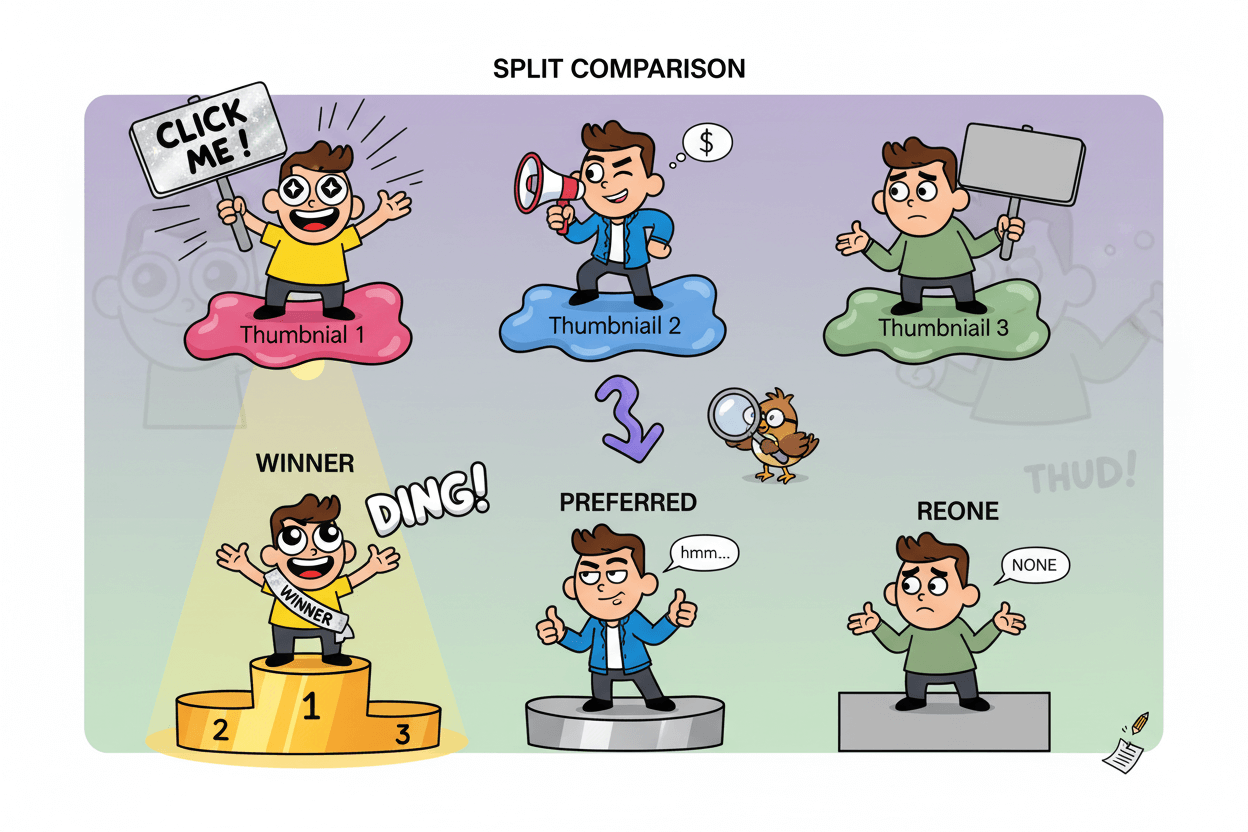
Don’t guess. Studio tests up to three thumbnails and calls Winner/Preferred/None by watch-time share.
Here’s the fast path. In YouTube Studio, open a video, go to Thumbnail → Test and compare, and upload up to three options. Publish or save.
The experiment runs for real viewers. Results usually finalize in a few days to about two weeks depending on impressions and how different your variants are.
When it’s done, Studio marks the result as Winner, Preferred, or None and shows it in Analytics → Reach.
do’s_and_don’ts
- Do make variants visibly different at first. It speeds up conclusions.
- Do keep file quality high; thumbnails under 1280×720 may be downscaled in experiments.
- Don’t rely only on CTR. The system optimizes outcomes using watch time share to favor lasting engagement.
Set up the experiment and pick a primary metric
Create two or three clearly distinct options: tighter crop, stronger contrast, or a different focal subject. Start the test from the video’s Thumbnail area.
YouTube runs a true concurrent A/B/C so all options are shown at the same time to different viewers, removing timing bias common in sequential tests. Measure success by the platform’s watch time share decision, not a single surface metric.
Read outcomes: Winner, Preferred, or None
- Winner means a statistically confident outperformer based on watch time share.
- Preferred likely did better but with lower certainty; you can still adopt it and retest.
- None means performance was similar; keep your default or iterate big visual changes and rerun.
Cadence: when to stop, when to iterate
Let tests run until Studio finalizes results, or stop manually if you must ship a time-sensitive creative. If you rarely get a Winner, increase visual diversity between variants and test on videos with higher impressions.
When you find a winning pattern, apply it to similar videos and schedule your next round with new ideas.
Patterns That Work for Faceless Channels
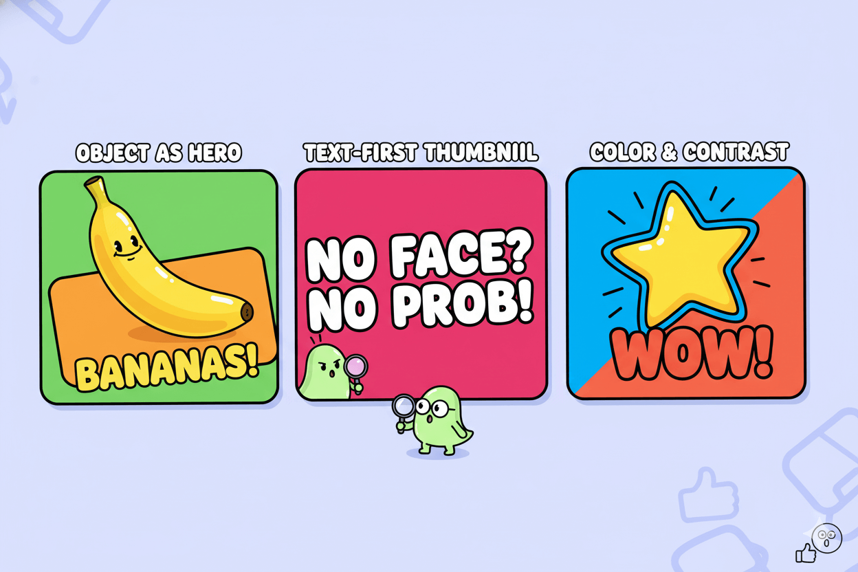
No face, no problem. Lead with one unmistakable object or symbol plus bold, short text.
Design decisions should enforce instant recognition at phone size. Choose one unmistakable element as the hero, crop tightly, and keep the rest quiet.
Favor a widescreen composition that survives shrinkage and preserves crisp edges. When text is needed, limit it to a few strong words that separate cleanly from the background.
Use the standard 16:9 frame at 1280 × 720 so details render sharply across devices.
Faceless thumbnails benefit from repeatable patterns. Build a small system: one background treatment, one icon style, one accent color, and a predictable text lane.
Rotating these ingredients creates variety without visual noise. Test bolder changes first to accelerate YouTube’s Test & Compare conclusions on real traffic; if results are similar, iterate again with more visual distance between variants.
Object or scene as hero
Center one physical object, tool, or result. Crop to remove clutter. Add a simple shape behind the subject to separate it from the background, then angle or scale slightly for energy.
This preserves clarity at small sizes and works well for tech, crafts, cooking, and gear reviews. Keep the aspect ratio and export size consistent to avoid compression artifacts that can blur edges.
Text-first thumbnails without clutter
If text must carry the idea, limit to three to five words, stack lines cleanly, and use strong contrast against a plain field. Pair with a symbol or silhouette rather than a detailed photo so the message remains legible on mobile.
Continue to refresh styles as tastes shift and monitor performance over time in Studio.
Color and contrast that survive small previews
Select one accent color and one neutral. Use them to create obvious figure-ground separation around the subject or headline. Avoid gradients behind small type, since they can smear after scaling.
A 16:9, 1280 × 720 export helps preserve sharpness so these contrast choices pay off.
Refresh Old Videos: Win Back Impressions With New Thumbs
Mine your back catalog. Target high-impression, low-CTR videos and retest thumbnails.
Pick the right candidates
Open YouTube Studio → Content → select a video → Analytics → Reach. Sort or scan for clips with meaningful impressions and below-median CTR for your channel. These videos already get seen.
A stronger thumbnail can convert a larger share of the same traffic without publishing anything new today. Keep a short list and note each video’s current CTR as your baseline.
Make 2–3 consistent variants fast
Create two or three visibly different options in Pikzels: tighter crop on the subject, higher text contrast, or a new focal object for faceless videos. Export at 1280 × 720, 16:9, ≤2MB to match platform rails.
Save filenames that encode the change you made so you can learn from winners later.
pro_tip: Aim for differences you can see at phone size. Small tweaks slow tests. Big visual distance helps the system finish sooner.
Interpret results and scale the winners
On each target video, go to Thumbnail → Test and compare and upload up to three options. You can test existing videos, not just new uploads. Studio runs the experiment for real viewers and returns Winner, Preferred, or None, based on watch time share.
Adopt the Winner when available. If Preferred or None, iterate with larger visual changes or move the test to a higher-impression video. Repeat on the next candidate in your list.
before_after: Capture a simple table with baseline CTR vs. post-test CTR and the outcome label. Track 14–30 days after adoption to see if lifts hold while impressions stay similar. Use the same Reach tab to compare.
do’s_and_don’ts
- Do prioritize videos with enough impressions to conclude tests faster.
- Do keep titles constant while testing thumbnails to isolate the variable.
- Don’t promise gains; results vary by audience and volume. Use Studio’s labels to decide.
Accessibility and Compliance: Contrast, Clarity, Community Guidelines
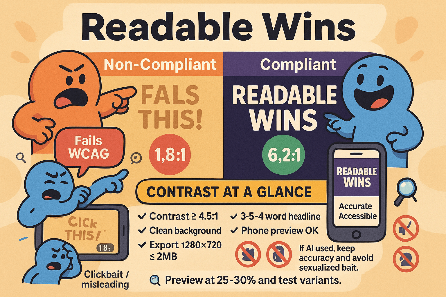
Readable wins. Strong contrast and honest imagery keep viewers and policies on your side.
myth_buster: “If people can kind of read it, it’s fine.” Not true. Accessibility standards define what “readable” means. Use them as rails, even for text inside images.
Contrast and type size that survive mobile scaling
Check color contrast before you export. WCAG requires at least 4.5:1 for normal-size text and 3:1 for large text; aim higher when possible because thumbnails shrink on phones. Use a contrast checker, then preview at ~25–30% zoom to emulate mobile size.
If edges blur, reduce background noise or add a simple shape behind text.
Keep text short—three to five words—and favor bold, clean fonts. YouTube’s guidance highlights readable fonts and simple layouts that stand out in feeds. Export at 1280×720, 16:9, ≤2MB so your crisp type isn’t degraded by scaling.
Stay within Community Guidelines and avoid misleading imagery
Thumbnails must follow Community Guidelines. Avoid nudity, graphic violence, and misleading visuals; violative images can be removed and repeat offenses risk penalties.
YouTube explicitly reminds creators that thumbnails are covered by the same policies as other images on the platform.
Accuracy matters. Don’t imply events or outcomes that the video doesn’t deliver. YouTube has stepped up enforcement against clickbait that uses misleading titles or thumbnails, with removal actions expanding beyond initial test regions.
Honest packaging protects trust and reduces policy friction.
If you use AI-generated elements, that’s allowed, but the same rules apply: keep content accurate, avoid sexualized or shocking bait, and represent the video faithfully.
When in doubt, choose the variant that best matches the video’s core promise and then validate it with Test & Compare.
Understand platform experiments that affect how thumbs appear
Context can change. In 2025, YouTube began testing blurred thumbnails in certain sensitive or mature search contexts. Titles and channel names remain visible, and viewers can choose to unblur.
Plan for this environment by making titles informative and keeping thumbnails clear and compliant; your packaging should work even if the image is briefly obscured.
pro_tip: Add a quick accessibility pass to your export checklist: contrast ≥4.5:1 for small text, clean background, three-to-five-word headline, specs met, and a final phone-size preview. Then run the variant through YouTube’s native test so real viewers decide which accessible design performs best.
Localize Thumbnails for Global Reach
Pair multi-language audio with localized thumbnails to meet viewers in their language.
When to localize: signals and markets
Localize when you see sustained watch time or search demand from non-primary languages, or when you add MLA tracks for a market you care about.
YouTube reports that MLA can shift a meaningful share of watch time to non-primary languages; pairing dubs with localized thumbnails makes the click decision feel native.
Start with your top two languages by impressions and build a repeatable process.
quick_win: If MLA is enabled on your channel, check if the localized thumbnails pilot is available to you. Some creators already have access; broader availability is expected as the feature rolls out. Prioritize languages where thumbnails with translated text or culturally familiar imagery will clarify the promise fastest.
Design text-light visuals that travel
Keep words minimal so fewer assets need translation. Favor strong subject focus, simple shapes, and icons that resonate across cultures. If you must show text, translate it faithfully and avoid idioms.
Maintain brand elements—colors, logo, framing—so localized variants still look like you. This preserves recognition while improving clarity for non-primary audiences.
Use YouTube’s standard 1280 × 720, 16:9, ≤2MB export to keep edges crisp across regions.
myth_buster: Localization is not only about text. Culturally relevant imagery and color choices can reduce confusion and speed recognition, especially in crowded mobile feeds. Validate these choices on real traffic.
Test per region where feasible
When localized thumbnails are available, align each language’s thumbnail with its dub and monitor results in Analytics → Reach.
If your access is limited, you can still compare variants globally with Test & Compare, then ship the visual style that generalizes well before you invest in full translation.
Larger visual differences finish tests faster; higher-impression videos conclude sooner. As YouTube expands localized thumbnails, rerun tests per language to confirm lift.
before_after: Create a baseline thumbnail with universal visuals. Create a localized version that swaps any text and adjusts symbols for one target language. Run a head-to-head test on a high-impression video, then apply the winning pattern to the rest of that language’s catalog.
pro_tip: Document translations, fonts with the right character support, and any layout tweaks. Reuse the system for future uploads so each new dub ships with a native-feeling thumbnail on day one.
YouTube’s own blog confirms the multi-language thumbnails pilot is underway, so expect broader access.
Conclusion
You win clicks by design and by proof. Keep thumbnails simple and readable, export at 1280×720, 16:9, ≤2MB, then let Test & Compare pick the champion on real traffic.
Start every video with two or three visibly different options: a tighter crop, higher contrast text, or a clearer focal subject. Ship the Winner when Studio confirms it, or iterate boldly if the result is Preferred or None.
Results vary by audience and impressions, so the platform’s own readout is your north star.
Use Pikzels 3.0 to reach testing speed. Face swap strengthens recognizability, text tools make short words pop on phones, and fast background changes help you create clean, on-brand variations in minutes.
Then refresh your back catalog: target high-impression, low-CTR videos, run a test, and roll the winning pattern across similar uploads.
As your audience globalizes, pair multi-language audio with localized thumbnails where available to meet viewers in their language.
Your immediate action plan:
- Draft three variants for your next upload.
- Export to spec and launch a Test & Compare.
- Queue three back-catalog tests.
- Document what wins so your next round is faster.
Simple, fast, and measured. That’s how you turn thumbnails into consistent clicks—without needing design skills.


