Best Choice

Scale gg
Instead of staring at a blank screen, you feed ScalePlus what you sell and who you sell to, and ClickCampaigns.ai builds the ads, emails, posts, and funnel copy for you. That means the numbers you see in your dashboard are tied to campaigns that were made to convert from day one, not patched together at midnight.
Best for Conversations

Replient Ai
Replient pulls every comment from Facebook, Instagram, TikTok, LinkedIn, & YouTube into one dashboard so you actually see what people are asking for and worried about. Those patterns become a live story of what your market wants, & you can answer with offers, links, & next steps that turn conversations into sales.
Best for Personal Data

Score App
Instead of giving everyone the same PDF, you use ScoreApp to give each person a tailored results page with insights and recommendations based on their score. That makes your data feel like a mirror they actually want to look into, and it builds the kind of trust that leads to sales calls and checkouts to earn a dollar more.
Best for List Nurtuing

Tinyemail
TinyEmail gives you clear analytics on opens, clicks, and conversions so you can see which emails are actually driving revenue, not just vanity metrics. When you pair that with their segmentation and workflows, each number becomes a hint about what to say next and to whom on your customers list like a real pro in the game.
Friend to friend: a few links are affiliate links. When you purchase, I might get a tiny thank-you from the company, with zero added cost to you. I only recommend things that I’ve actually tried and looked into. Nothing here is financial advice; it is for entertainment. Read the full affiliate disclosure and privacy policy.
You don’t need a data team—just one focused number each week. In under 25 minutes, turn that number into a short story, one chart, and one next step.
Use $0 tools you already have and track progress on a simple scorecard. Clear, quick, repeatable.
Think of it as a weekly habit. You pick one key number, notice the pattern, explain what it means for customers, and choose one next step.
Leaders and teams understand faster when numbers arrive as a story they can repeat. This approach appears across respected guides and tools, from training providers to platforms you already know.
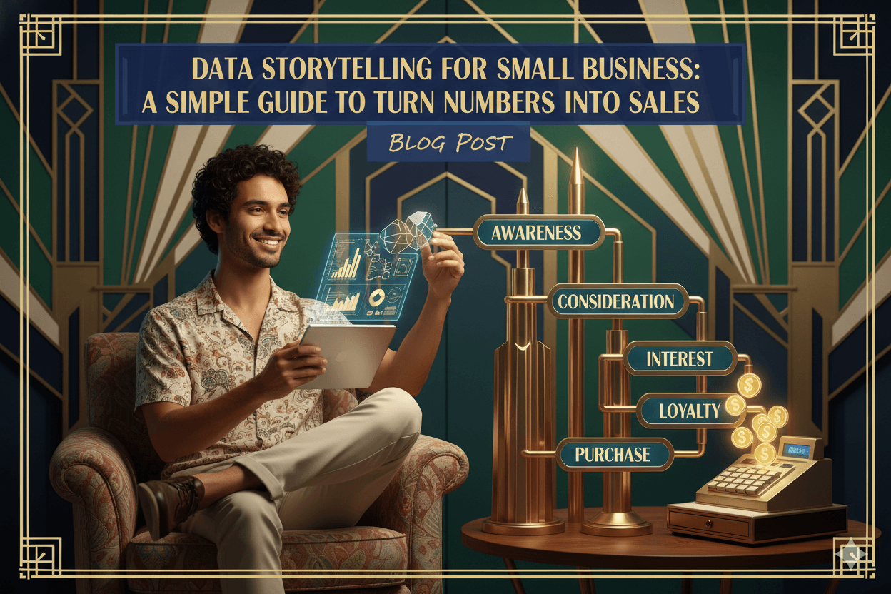
What Data Storytelling Really Means for Small Businesses
Swap dashboard overwhelm for one clear message your team can repeat—what changed, why it matters, and the next step.
Data storytelling is simply taking the numbers you already track and wrapping them in a short, human message so your team and customers understand what changed… and what to do next.
At its core, data storytelling blends three parts: data (your facts), visuals (a simple chart), and narrative (plain words that point to a decision).
Leading guides define it as building a compelling narrative from analysis to inform and influence an audience; vendor and education resources echo the same trio. StoryIQ+1
It turns flat, numeric information into context people can grasp and relate to, especially when they are not technical.
A simple definition you can use with your team
Say it like this: “We use our numbers, a quick chart, and a short explanation to decide what to do next.”
Microsoft and HBS Online describe the practice as developing a narrative around analysis so insights become clear and actionable for any audience.
How data storytelling is different from just looking at reports
Reports tell you what happened; stories explain what it means and what you will try next. Definitions emphasize translation into understandable terms that support a business decision or action.
This is why even a basic bar chart plus two sentences can outperform a crowded dashboard for busy owners.
pro_tip: Keep one takeaway per story. If you have two, you have two stories. Use a second email, slide, or post tomorrow. storytelling with data
Where your business data lives today (and what it’s trying to tell you)
You already have the raw ingredients. Email platforms surface opens, clicks, and revenue per send; these metrics fuel stories about subject lines, timing, and offers.
Website and store analytics show traffic, add-to-cart, and checkout steps; these hint at friction to remove or pages to feature. Heap
Even a simple POS or audience dashboard helps you spot best-selling items and segments; those become stories about bundles, upsells, or local promos.

When you frame numbers as a clear message, people remember and act. Definitions and practitioner guides stress context, plain language, and decision support—the heart of small-business data storytelling.
The Numbers-to-Narrative Loop: A Simple Data Storytelling Framework
A six-step loop you can run in 20–30 minutes: one KPI, one pattern, one sentence, one chart, one test.
You do not need a lab or a dashboard wall. Practitioners and trainers all point to the same essentials: choose a focused objective, find a pattern, explain it clearly, and move your audience to action. StoryIQ
This small-business-ready loop keeps the work simple and transferable across email, web, or POS data. It echoes established frameworks (StoryIQ’s stepwise guidance; Microsoft’s topic hub) and trims them to the bare moves you’ll use every week.
Step 1–2: Pick your KPI and spot a pattern
Start with one KPI tied to a real goal (e.g., weekly sales, revenue per email). Focusing attention improves clarity and makes your story memorable. Next, scan for a pattern—rising, falling, flat, or seasonal—over a relevant time window or segment.
Guides emphasize keeping the objective tight and reading trends before jumping to visuals.
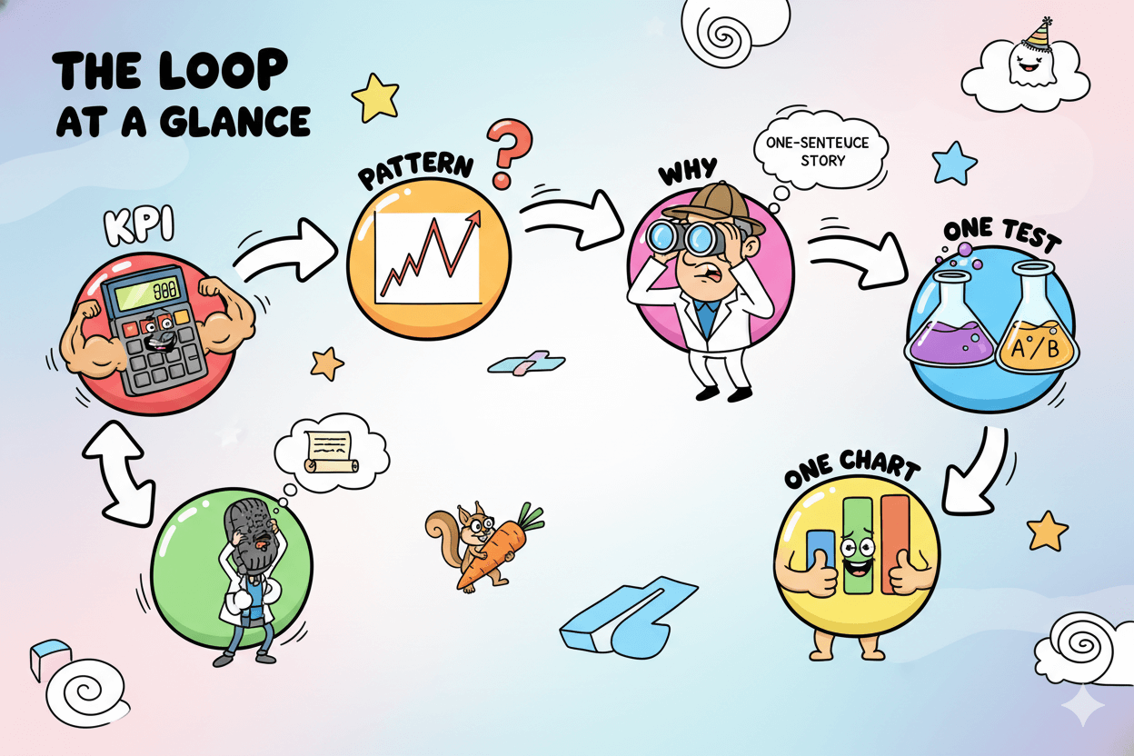
Step 3–4: Ask why and write a one-sentence story
List two or three plausible causes (offer, channel, timing, audience). Then write a one-sentence story: “Because {cause}, our {KPI} {pattern}, so we’ll {action} next.”
Trainers stress moving beyond “what happened” toward meaning and recommended action—that’s how data influences decisions rather than sitting in a report.
Example: “Because we featured bundles on payday weekend, average order value rose, so we’ll test bundles again next payday and add free local delivery.”
Step 5–6: Show one visual and run one tiny test
Choose one clear chart (bar for comparisons, line for trends, pie only for simple parts of a whole). Microsoft’s guidance: match chart to message and keep clutter low so the takeaway lands fast.
Then define one tiny test (subject line, offer, timing, audience slice) and schedule a follow-up check; this turns the story into movement.
Why this loop works: it aligns with respected frameworks while staying small-business practical. It keeps you out of analysis bloat and inside a rhythm that builds judgment week by week.
Over time, that rhythm compounds into better decisions and cleaner communication.
Everyday Data Stories That Turn Numbers Into Sales
Three copy-ready mini-cases—email, funnel, local services—you can run this week with $0 tools.
You learn the fastest when you see it done. Below are three short, real-world patterns you can copy this week.
Each starts with one number, adds a simple chart, and ends with a next step you can run without extra staff or tools you do not already use.
Email recap story: from open rates to better subject lines
Start with your last three campaigns. Look at open rate and click rate side by side. If opens are steady but clicks dipped, your subject is fine and your offer or call to action needs attention.
Write a one-sentence story: “Clicks fell after the long headline, so we will test a shorter benefit line with the same offer.”
Tinyemail’s guidance encourages reading campaign metrics as a story and using them to shape messages, timing, and content.
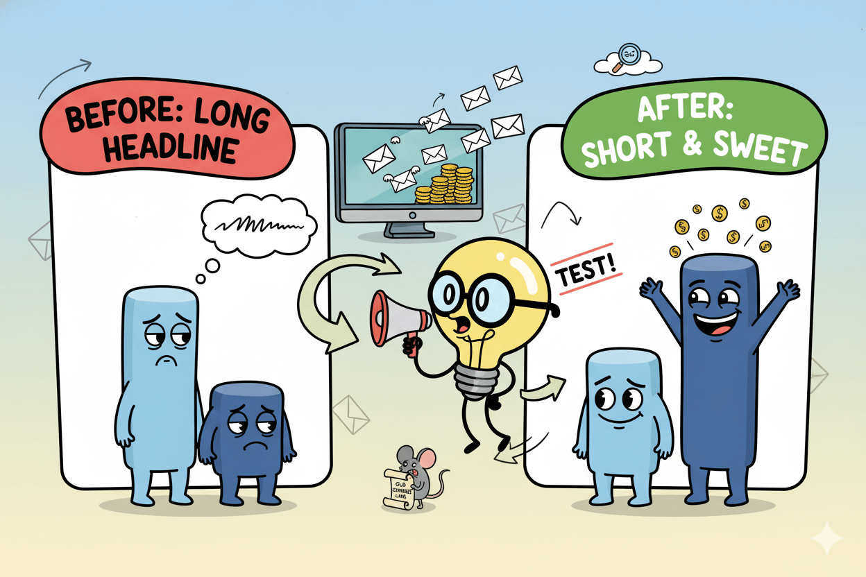
quick_win: Test one variable per send. Keep the story tight: number → insight → next step.
Funnel story: where your leads quietly disappear
Pull a simple funnel for your shop: view item → add to cart → checkout → purchase. If add-to-cart is strong but checkout is weak, the story is about friction at payment or shipping.
Your one-sentence story: “Many carts stall at checkout, so we will surface guest checkout and show total cost earlier.” Industry guides outline these common funnel waypoints and how drop-offs point to practical fixes.

Local service story: bookings, reviews, and referrals talking back to you
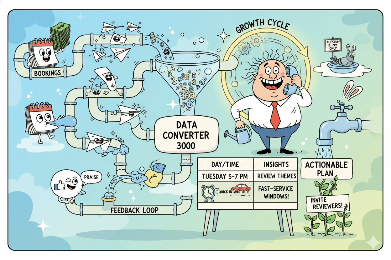
Open your calendar and review sources for last month’s bookings. Pair that with highlights from customer reviews. If Tuesday 5–7 pm fills fastest and reviewers praise “quick in-and-out,” your story is about convenience.
Next step: create a “fast-service window” on two more weeknights and invite recent reviewers first.
Playbooks for feedback analysis and booking experience agree that small signals in reviews and scheduling can drive practical service changes. Thematic
A mini case-study template you can copy
Use this five-line outline any time:
- KPI: the one number that matters this week.
- Pattern: up, down, flat, or seasonal.
- Why: two likely causes you can influence.
- Story: one sentence that explains the change.
- Action: one test and a follow-up date.
For simple makeover inspiration, “storytelling with data” demonstrates before/after examples that show how small visual changes make the message land faster and friendlier. storytelling with data
Using AI as Your Data Storytelling Co-Pilot
Let AI spot patterns and draft words; you make the call. Faster insight, same voice.
You do not need a big team to find patterns and words. Modern AI can scan your sales or campaign data, surface what changed, suggest charts, and draft a first pass in plain English.
You keep the judgment and the voice. AI speeds the work; you steer the story.

Let AI spot patterns in your numbers for you
AI systems can automatically highlight trends, outliers, and possible drivers, then explain them in everyday language.
Tableau Pulse is designed to flag the changes that matter most and summarize them with text and visual explanations, helping you understand the “why” behind a metric.
Let AI draft your first version of the story
Once patterns are clear, ask the tool for a short narrative you can refine. Generative AI excels at producing natural-language summaries that turn metrics into a message.
Practitioner overviews describe how AI-generated narratives speed editing while you keep the point accurate and brand-true. Tableau
pro_tip: Give the AI your goal and audience first. For example, “Write a two-sentence update for customers about why weekend bundles lifted average order value.” Then edit for tone and promise.
Let AI suggest visuals and simple dashboards
Some platforms recommend chart types from your fields or a natural-language prompt. Qlik’s Insight Advisor can choose dimensions, measures, and visualization types, and it can adjust suggestions as you add or remove fields.
Guardrails so your stories stay honest and clear
Treat AI as an assistant, not an oracle. Microsoft’s topic hub and documentation stress choosing visuals that match message and using unbiased interpretation.
Keep claims grounded in the data you actually have, and review AI text for accuracy, privacy, and respect for your customers.
How to Share Data Stories in Email, Social, and Sales Conversations
One core message, three formats: inbox, feed, and call. Keep the takeaway identical—change only the wrapper.
Your story only works if people see it. The same number can travel across channels: a fuller version in email, a snackable version on social, and a conversational version in sales.
Keep the core message identical and let the format flex so the takeaway lands fast.

Email stories: from numbers to nurturing
Pick one campaign metric—open rate, click-to-open, or revenue per send—and make it the headline. Add one sentence that explains what changed and why subscribers should care, then ask for one action.
Current email guidance highlights click-to-open as a tight quality signal for message–offer fit; improving it often comes from clearer copy and better-aligned CTAs.
Moosend storytelling guidance echoes this: treat metrics as narrative prompts and keep presentation simple and human.
do’s_and_don’ts:
Do spotlight one metric and one action. Don’t cram multiple asks. Do match subject, body, and CTA so the click feels expected.
Social posts: turning one chart into a moment of truth
On social, shrink the story. Use one visual (tiny bar or line) plus a single caption that names the insight and the “so what.”
Platforms and social best-practice guides recommend simple visuals, minimal text, and a concrete invitation—comment, save, or tap.

micro_challenge: Post one weekly chart with a 12–15 word caption that names the change and the next step. Track saves and replies as your signal.
Sales conversations: telling short, confident stories that feel human
In sales, your story backs a recommendation. Lead with one relevant data point, give a one-sentence explanation in the buyer’s language, then tie it to a suggested next step.
HBR and enablement sources note that data adds credibility when presented inside a narrative tailored to the buyer’s needs; the right story—not more slides—drives agreement.
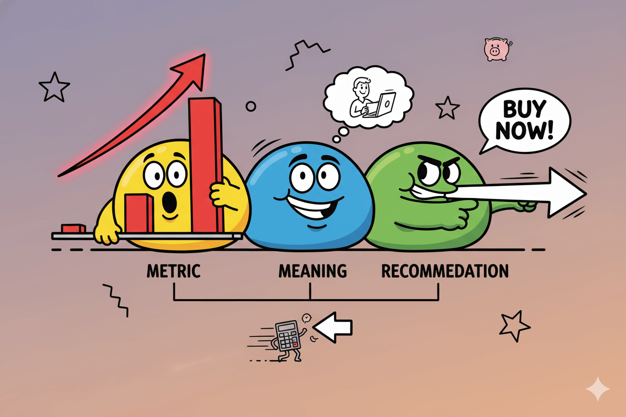
When each channel carries the same core message, your audience meets one clear idea many times, not many ideas once. That repetition—metric, meaning, next step—is how data stories move from insight to action.
Measuring the Impact of Your New Storytelling Habit
A five-number scorecard that proves your stories work—no spreadsheet rebuild required.
When stories meet numbers, progress becomes visible. Treat your storytelling like a monthly experiment: choose a few signal KPIs, compare before/after, and keep only what moves customers to act.
Education and platform guides converge on a short list—open rate, click(-to-open), conversion, and order value—as clean indicators of audience response and sales lift.
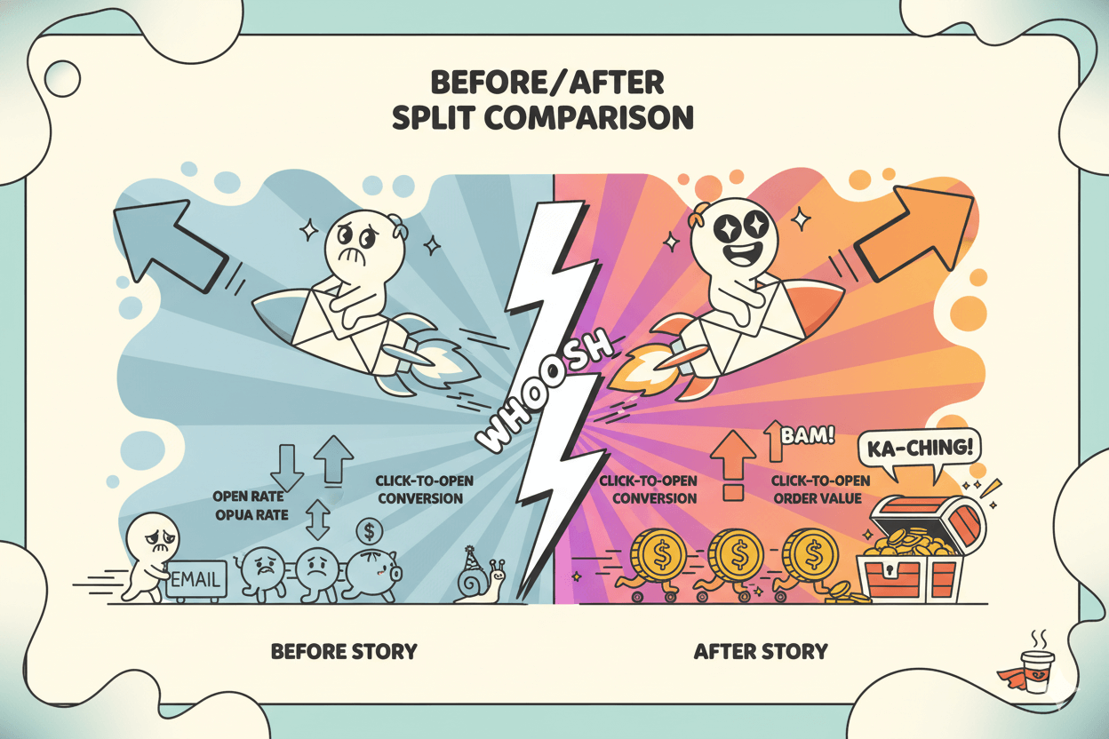
A simple scorecard: five numbers to watch
Start lean. Track open rate, click rate/CTOR, conversion rate, average order value, and reply/response rate (if you invite replies).
Vendor docs define and report opens/clicks/CTOR; use those native dashboards rather than building from scratch.
before_after: Log one story per week. At month’s end, compare “baseline” vs. “after story” for each metric and keep one learning.
Monthly review: write the next chapter
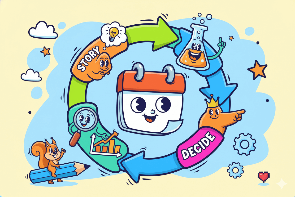
Once a month, write a five-sentence recap: what changed, the likely cause, the story you told, the test you ran, and the next decision. Measurement frameworks recommend a test-and-learn cycle where stories inform the next action, not just the report. Amplitude
When it’s time to add new tools or training
If your scorecard shows flat lines for two or three cycles, upgrade your inputs or your view. Options: a lightweight KPI scorecard widget, clearer attribution in analytics, or a short storytelling refresher for the team.
Examples from BI platforms show how comparative KPI views and cleaner narratives reduce effort and improve decision-making.
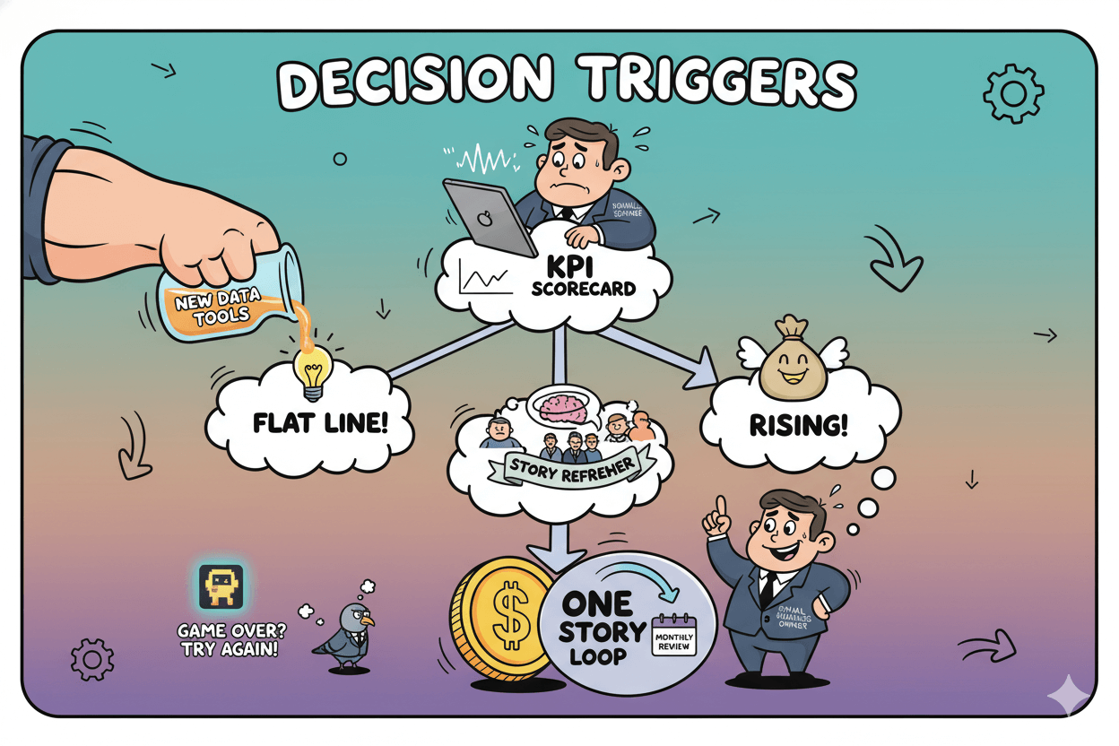
The payoff of this habit is clarity. You are no longer chasing every metric—you are repeating one story loop, measuring the response, and making the next decision with confidence.
Keep the scorecard small, the review monthly, and the tests humane and practical for your customers.
Next Steps: Practice Rounds and Tools to Explore
The 30-day plan: one story a week, $0 tools, Friday “story sprint” in 25 minutes.
You build this skill the same way you build any craft—by showing up on a schedule. Over the next 30 days, run one tiny loop each week: choose one KPI, spot the pattern, write one sentence of meaning, add one clear chart, and test one next step.
Keep it light; consistency beats complexity. Guides from StoryIQ and Microsoft favor simple, repeatable flows you can learn quickly and reuse everywhere.
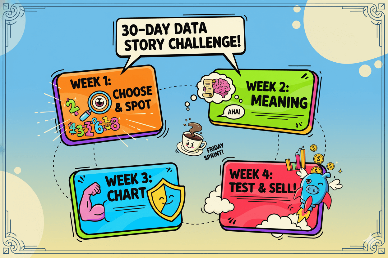
A 30-day practice plan to make data storytelling feel natural
Week 1: Pick one sales or email KPI. Compare this week to last week. Write your one-sentence story. Share it with your team or audience in one channel.
Week 2: Repeat with a funnel step (e.g., add-to-cart → checkout). Choose one chart that matches the message (bar for comparisons, line for trends).
Week 3: Use reviews or qualitative notes to enrich the story behind a metric. Share one before/after example. Thematic
Week 4: Combine two weeks of patterns into a short monthly recap and set next month’s hypothesis. Keep a scorecard of opens, clicks/CTOR, conversions, and order value.
micro_challenge: Schedule a 25-minute “story sprint” each Friday. Timer on. One KPI, one chart, one next step. Repeat weekly for a month.
Tools to try as your stories get bigger
Start with what you have, then add tools by category, not brand hype.
- BI / dashboards with AI helpers: Power BI adds storytelling guidance and features for focused visuals. Tableau Pulse introduces metric insight summaries and enhanced Q&A. Qlik’s Insight Advisor suggests chart types from your fields.
- Lightweight visuals & infographics: Infogram focuses on quick charts and accessible visuals; recent posts highlight accessibility and inclusive design.
- SMB marketing & data sources: Encharge’s library shows how to turn campaign metrics into stories you can act on.
- All-in-one SMB analytics: Zoho’s Zia Insights generates automated textual and visual narratives to explain significant changes—useful for a first pass before you edit the story yourself.
Pro move: Add tools only when a use case is clear (e.g., “we need automated chart suggestions for faster reporting” → Qlik Insight Advisor; “we want metric narratives in plain English” → Tableau Pulse).
This keeps spend disciplined and the workflow focused.
Where to learn more without drowning in jargon
Use short, applied lessons. StoryIQ’s posts are step-by-step and beginner-friendly. Microsoft’s topic hub offers tips and examples you can mirror.
Mailchimp’s library shows how to translate marketing metrics into stories your subscribers understand. Skim, practice the loop, and come back when you hit a new edge.
Conclusion
Your numbers are already speaking. With a simple weekly loop—pick one KPI, notice the pattern, say what it means, and try one next step—you turn scattered metrics into a story your team can repeat and your customers can feel.
That is data storytelling in plain clothes: data + a clear visual + a short narrative that points to a decision people can act on. Authoritative guides agree this is how complex analysis becomes understandable and useful in day-to-day business.
As you practice, let AI handle the heavy lifting—surface trends, suggest chart types, draft a first pass—while you keep judgment, tone, and promises honest.
Treated as a co-pilot, these tools make insight-to-action faster without replacing your voice.
Close the loop each month with a tiny scorecard of opens, clicks, conversions, and order value, then keep what works and move forward.
Over time, small stories stack into momentum. Your data becomes direction; your direction becomes revenue. Start with one number this week, one chart, one next step… then write the next chapter.

Scale gg: Turn your data into “do this next” moves

Replient Ai: AI answer like your best version of you, 24/7

Score App: Let your audience tell you their whole story in one quiz

Tinyemail: Let automation quietly tell your customer’s story in the background


