
School Of Money: The One-Weekend Funnel
Build a quick sales funnel that fits right into your busy life this Friday: just one page, one lead magnet, and a small paid offer. This straightforward approach is perfect for small businesses. By Monday, you’ll see what’s working well and what you could tweak to do even better.
Friend to friend: a few links are affiliate links. When you purchase, I might get a tiny thank-you from the company, with zero added cost to you. I only recommend things that I’ve actually tried and looked into. Nothing here is financial advice; it is for entertainment. Read the full affiliate disclosure and privacy policy.
You don’t need a complex stack to win. You need one page, one magnet, and one easy-yes offer you can ship this weekend. Aim for a 6–8% opt-in and watch clicks (~2% CTR) to guide every next step.
This guide gives you a beginner-friendly build: one landing page, one lead magnet, one easy-yes offer, and a short welcome sequence. You’ll set honest goals using fresh benchmarks so progress feels real. – Salesforce
For landing pages, a broad, cross-industry median sits around 6.6%, which makes 5–8% a practical first target; higher percentiles come later with iteration. For email, focus on clicks, not opens.
A recent multi-industry review shows ~2.0% average click rate, which is a cleaner engagement signal in today’s privacy environment.
We’ll use these numbers to anchor your expectations, guide your tests, and help you celebrate real wins as they show up. – Unbounce
What a Sales Funnel Is
A funnel is the path from attention to action. Use three simple stages you can measure today.
In practice, most beginner funnels work with three plain-language stages you can remember and measure. First, awareness: someone discovers you.
Next, evaluation (often called consideration): they size up your offer and alternatives. Finally, action: they buy or book. Big vendors describe the same journey with slightly different names and stage counts, which is normal; the core idea never changes.
For this guide, you’ll use a minimum-viable funnel so you can launch without overload: one landing page, one clear lead magnet, one easy-yes starter offer, and a short welcome sequence.
That structure mirrors standard stage models while removing branching that slows beginners down. As you collect data, you can add steps, but you don’t need them to get moving.
The stages you’ll actually use (awareness → evaluation → action)
- Awareness: a post, ad, sign, or referral leads to your landing page. Your only job is clarity about the problem you solve. Leading definitions agree this is the moment someone enters the journey.
- Evaluation: your page or thank-you content answers the key questions and previews the first paid step. Major guides frame this as the middle where prospects compare options. – HubSpot Blog
- Action: the visitor opts in and takes a simple paid next step. Enterprise playbooks describe this as purchase/close; for you, it may be a consult or a $5–$29 offer.
One-page funnel overview for beginners
Start with a single path you can launch this week:
- Landing page with one promise and one form.
- Thank-you page that delivers the magnet instantly and previews the starter offer.
- Short welcome sequence that reinforces value and invites the first purchase.
This flow matches the big-brand definitions of the funnel while giving you a fast way to measure each step and improve it.
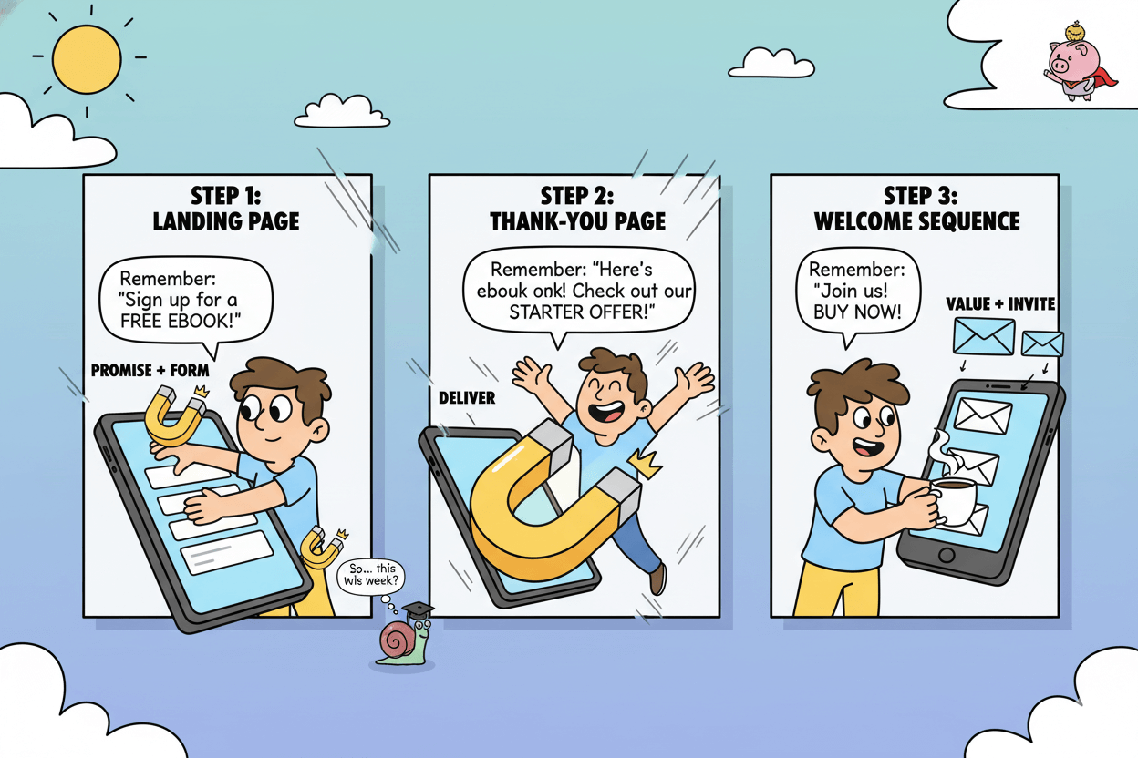
quick_win: Write one sentence for each stage: “If they only remember one thing here, it’s ___.” Then check that your page and emails deliver exactly that promise.
Pick Your Lead Magnet (short, useful, mobile-friendly)
Solve one small problem in minutes. Choose a checklist, template, mini-audit, or quick quiz that delivers now.
Formats that convert for SMBs now (with examples)
Start with bite-size assets. A one-page checklist or template works across local services and creator businesses because it removes guesswork in one move.
Recent roundups highlight these short formats alongside interactive options like quizzes, calculators, and mini-assessments that personalize value on the spot.
If you want inspiration, scan fresh galleries of 20+ real examples and 15 interactive ideas to see layouts, hooks, and CTAs that work today.
quick_win: If your service is consultative, ship a “mini-audit” with three yes/no checks and one recommendation. It mirrors the audit idea seen in current lists and naturally points to your paid help.
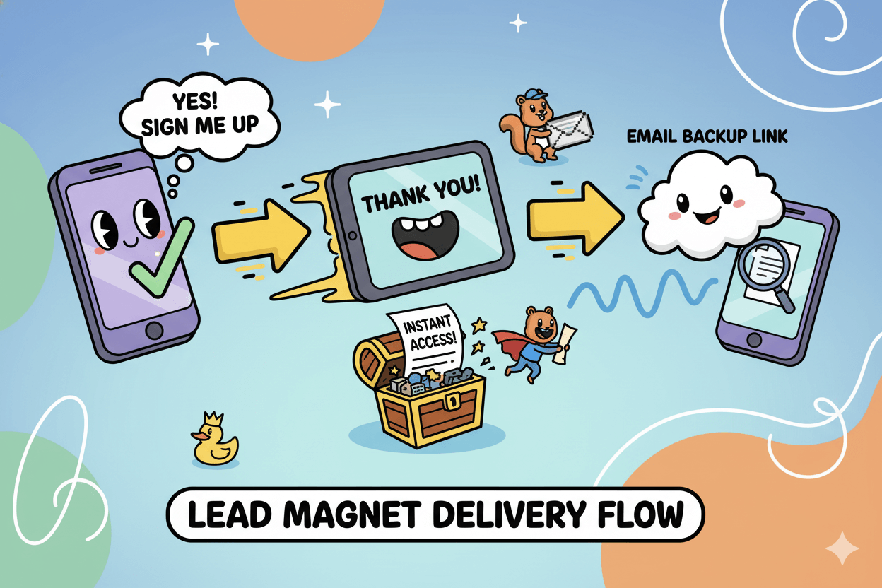
Deliver it cleanly on mobile (thank-you + email link)
Most signups happen on phones, so delivery has to be frictionless. Use a thank-you page that confirms the opt-in, gives instant access, and previews the next step.
Then send a backup link by email so the asset is easy to find later. Practical how-tos and pattern libraries show this flow clearly: landing page → thank-you with access → email automation.
Treat the thank-you page as a second chance to build trust and guide the first paid step.
Map magnet → starter offer logically
Your magnet should set up the first sale. If you give a “Home Maintenance Checklist,” the paid next step could be a $19 “Quick-Fix Video Pack” or a $29 “Starter Consult.”
Industry examples and vertical guides point to the same principle: the magnet solves one problem and frames the next decision.
Use the thank-you page to preview that offer, then repeat the invite in your welcome emails. Keep the decision easy with one CTA. – Wisepops
pro_tip: If your audience loves interactivity, consider a short assessment or calculator. These formats personalize the result and make the follow-up offer feel tailored, a pattern emphasized in 2025 idea lists.
Craft a Simple Starter Offer ($5–$29 that matches the magnet)
Make the first sale feel easy. Price for an instant yes and align it to your magnet.
Offer patterns that pair with your magnet
Match the paid step to the value you just delivered. Should your magnet be a checklist, sell a template bundle that fills in the blanks. If it’s a short guide, offer a mini-course with three tight lessons.
If it’s an assessment, sell a “lite audit” or a quick-start setup that implements the result. Keep the deliverable small enough to ship the same day or within 24 hours for service variants.
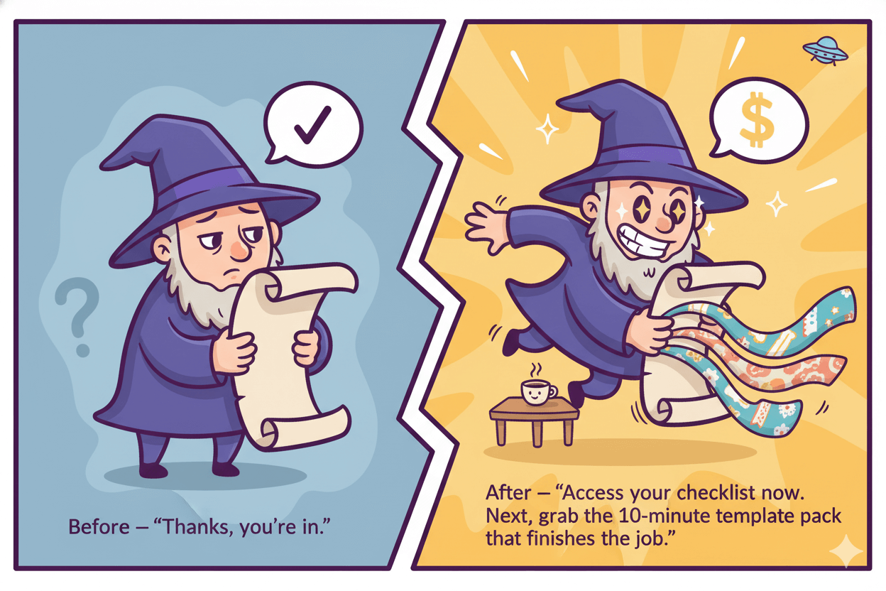
Then use your thank-you page to preview the paid step and move momentum forward; leading CRO guides treat the thank-you page as the next stage, not the finish line.
Price bands that feel easy to say yes to
For beginners, price for an impulse yes. Current playbooks place most tripwire or low-ticket offers in the $7–$27 band, sometimes up to the high twenties.
The psychology is simple: low risk, quick payoff, and no heavy decision-making. Treat these numbers as starting points rather than guarantees, then judge performance against real baselines.
Anchor your expectations to landing-page medians so you interpret results with context: across industries, the all-page median conversion is about 6.6%, with wide variance by vertical and percentile.
Your job is to test into your audience’s sweet spot.
pro_tip: Charm pricing (ending in 7 or 9) is common, but optional. Use the price that reads cleanly next to your value statement and proof. – The Copy Sanctuary
A quick page that sells without pressure
Build a single, fast page. Lead with the one promise, show a tiny preview or bullet list of what’s inside, add one specific proof point, and close with one CTA. Keep load time light and copy scannable, because most visitors arrive on mobile.
Remember today’s device reality from fresh benchmark work: mobile brings the bulk of visits, yet desktop still converts higher on average, so clarity and brevity on small screens matter.
Start testing headline vs. button copy first, then refine the offer if click-through is strong but purchases lag. Keep fields minimal, deliver instantly, and confirm by email so buyers can find the asset later.
micro_challenge: Draft your starter offer in 15 minutes: name, outcome, three bullets, one proof, one CTA. Price it in the $7–$27 band. Publish, then measure against your baseline for two weeks.
Build the Page and Form (fast, clear, single CTA)
One page. One promise. One form. Set a real goal and keep it readable on a phone.
Set an honest goal using fresh medians and percentiles
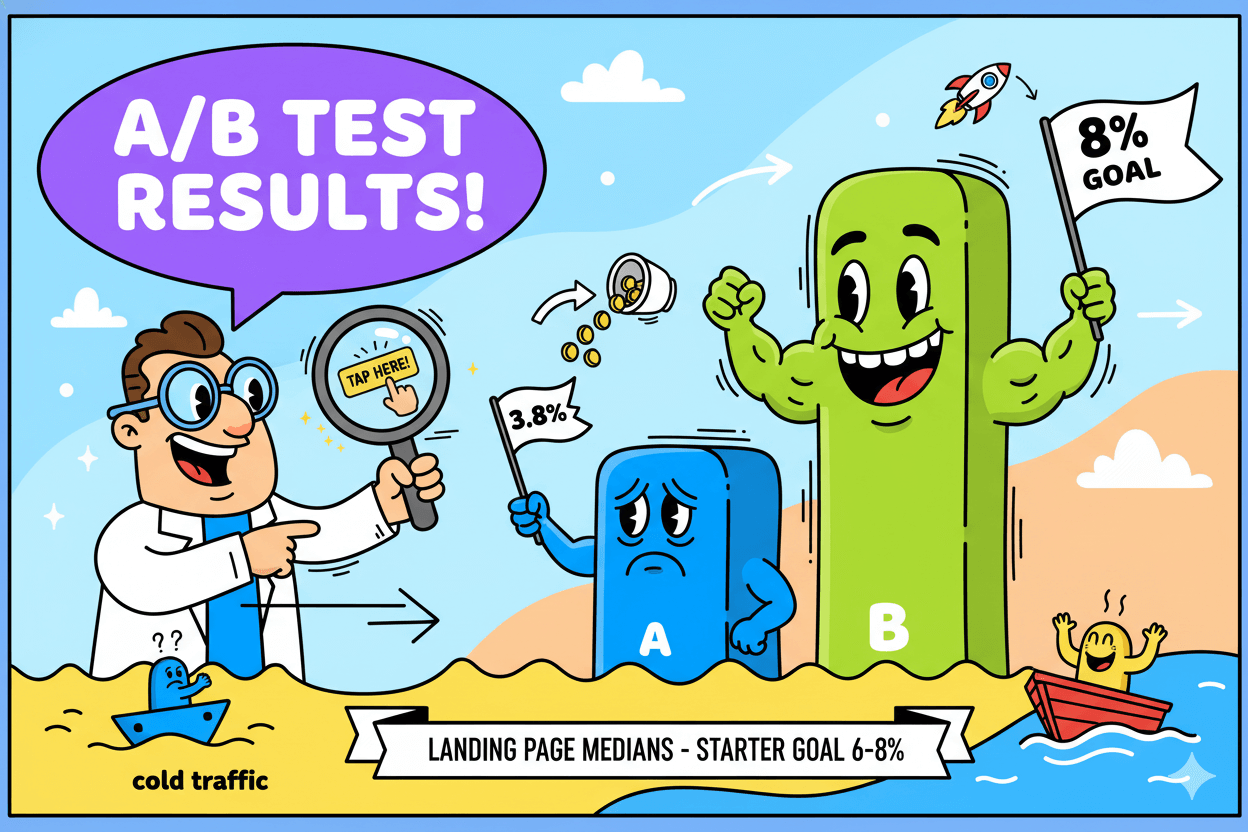
Treat 6.6% as your neutral baseline, not a promise. It comes from Unbounce’s analysis of 41k landing pages, 464M visits, and 57M conversions—broad enough to anchor expectations.
Some industries convert well below or above that median; for example, SaaS pages hover around 3.8%, while other verticals push into double digits.
Use percentiles to frame progress: crossing your category’s median means you’re beating half the field, while aiming at the 75th percentile is a strong next milestone.
Build a fast page that answers one question
Decide the one thing your visitor needs to know to say yes. Put that answer in the headline and first paragraph. Keep a single form field at the start (email), delay extras for later, and deliver the magnet instantly on the thank-you page.
Most traffic now arrives on mobile, yet conversion often skews higher on desktop, so brevity and clarity on small screens matter even more.
In one services category slice, 81% of visits were mobile, but desktop converted ~40% higher than mobile—evidence that tidy copy and simple forms protect results.
do’s_and_don’ts
Do: front-load the benefit, keep one CTA, compress images.
Don’t: stack multiple CTAs, hide the magnet, or ask for five fields.
Your first test and how to judge it
Start with one variable for a clean read. Test headline vs. button copy first because they touch clarity and intent. Run the test to confidence or a fixed time window, then compare against your baseline, not someone else’s screenshot.
If the page hits 6–8% with cold traffic, you’re on track; if you’re well below your category median, check message-market fit, page speed, and form friction before changing the offer.
Keep device splits in your report so you can see where to fix: if mobile lags heavily, tighten the headline, reduce above-the-fold clutter, and confirm tap targets with your thumbs.
Measure Weekly and Improve (two metrics, one test)
Measure less to learn more. Track opt-ins and clicks, then change one thing.
Two numbers that matter each week
Start with opt-in rate for your landing page and email click-through rate (CTR) for your follow-up.
CTR is the sturdier email signal in 2025 because privacy changes make opens noisy; MailerLite’s latest benchmark article explicitly recommends leaning on clicks for a truer read of engagement.
Their multi-industry study reports an average CTR of 2.00% across campaigns, with sectors ranging roughly 0.77%–4.36%. Use this as context, not a target, and build your own baseline over two to four weeks.
When you want a second reference point, check broad indices from major platforms.
Mailchimp’s live benchmark page shows All Users ~2.62% click rate with industry splits, while Klaviyo publishes 2025 click-rate ranges by flow and campaign type.
The exact figures differ by dataset and methodology, which is why your trend line matters more than a single global average.
For the landing page, keep using the ~6.6% median as your anchor for opt-ins, then adjust by vertical and traffic source quality. Treat every change as an experiment against that baseline.
How to run a clean A/B test
Pick one variable. Start with the headline or primary button copy because both touch clarity and intent.
Run the test to a fixed duration or until you’ve seen enough traffic to make a practical call, then log the result alongside your CTR and opt-in.
If performance shifts but not by much, don’t stack more changes; hold the winner and move to the next single lever. This cadence creates a readable improvement curve you can actually act on.
quick_win: Keep a single-screen worksheet: current opt-in %, current CTR, this week’s change, result next week. Repeat.
When to scale traffic
Watch the device split before you pour fuel on the fire. Unbounce’s latest benchmark hub shows a persistent pattern: ~83% of visits are on mobile, yet desktop converts about 8% better on average.
That means small fixes to mobile readability, tap targets, and form friction can recover meaningful wins before you spend more.
Also note exceptions: in legal, mobile can out-convert desktop—proof that intent and urgency shape behavior by category. Use these patterns to guide where you optimize first and which channels to scale.
If your opt-in stabilizes near your category median and your CTR trends above ~2%, start adding traffic from your best organic sources or a small paid test.
Re-check numbers weekly. If mobile lags, tighten the headline, shorten above-the-fold text, compress images, and avoid extra fields. Keep scaling only when your two metrics hold or improve under added volume.
Build a Real-Estate Lead Funnel Step by Step
Go from yard sign to calendar in four steps. Make every scan count.
Your four steps, from sign to inbox
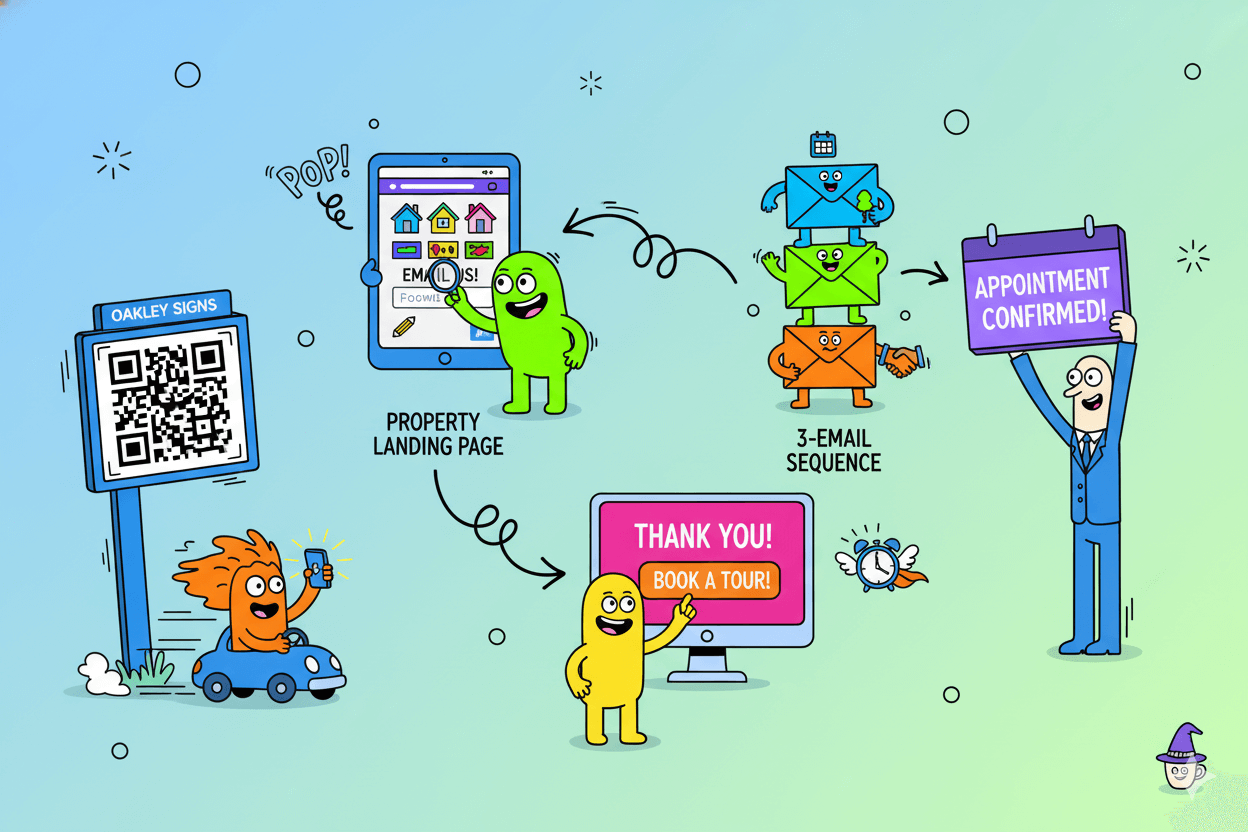
Step 1: Spark awareness onsite. Use your yard sign to send drive-by traffic straight to a clean landing page. – Oakley Signs
A QR code on the sign or rider gives instant access to photos, tours, and contact options, turning passive interest into tracked leads. Use a short callout like “See photos” or “Book a tour.”
Step 2: Capture interest with a focused page. The page should answer one question fast: “Is this home worth my time?” Show 3–5 hero photos, neighborhood highlights, and one form for email and optional phone.
Constant Contact’s real-estate funnel guide frames this as moving light interest into hot leads with a simple, repeatable flow.
Step 3: Deliver value and set the next step. After the form, the thank-you page delivers what they came for and offers a clear action: schedule a tour or request a quick pricing consult.
Oakley Signs’ funnel article echoes the need for a guided journey from interest to action, not a dead end.
Step 4: Follow up with a short sequence. Send three emails over seven days: confirmation with the tour link, neighborhood guide or seller checklist, then a simple appointment invite.
Constant Contact’s real-estate resources reinforce email as the backbone for nurturing and booking.
A simple appointment offer that converts
Make the next step feel easy. Offer two choices: a 15-minute phone consult or an on-site tour. Put the scheduler on the thank-you page and in every email.
Oakley’s 2025 yard-sign advice and QR guidance support clear, visible prompts that reduce friction from curb to calendar. If the listing is not a fit, pivot to “Get listings like this first.” Keep it one decision, one click.
What to measure in this vertical
Track three numbers weekly.
- QR scans → landing-page visits from signs and riders. Dynamic QR platforms show scans, devices, and locations.
- Opt-in rate on the property page. Compare open-house traffic vs drive-bys.
- Booked appointments per lead. Attribute using unique QR codes, short vanity URLs on signage, and dedicated numbers when needed. Real-estate signage guides recommend distinct tracking assets so you know which surface pulls.
If scans are high but opt-ins are low, tighten the page: clearer headline, fewer photos up top, and one form. If opt-ins are healthy but bookings lag, simplify the scheduler and repeat the invite in email two and three.
When this loop holds for one listing, clone it for the next and keep the data rolling.
Benchmarks That Keep You Grounded
Targets reduce guesswork. Use dated ranges and percentiles.
Landing-page ranges for 2025–2026
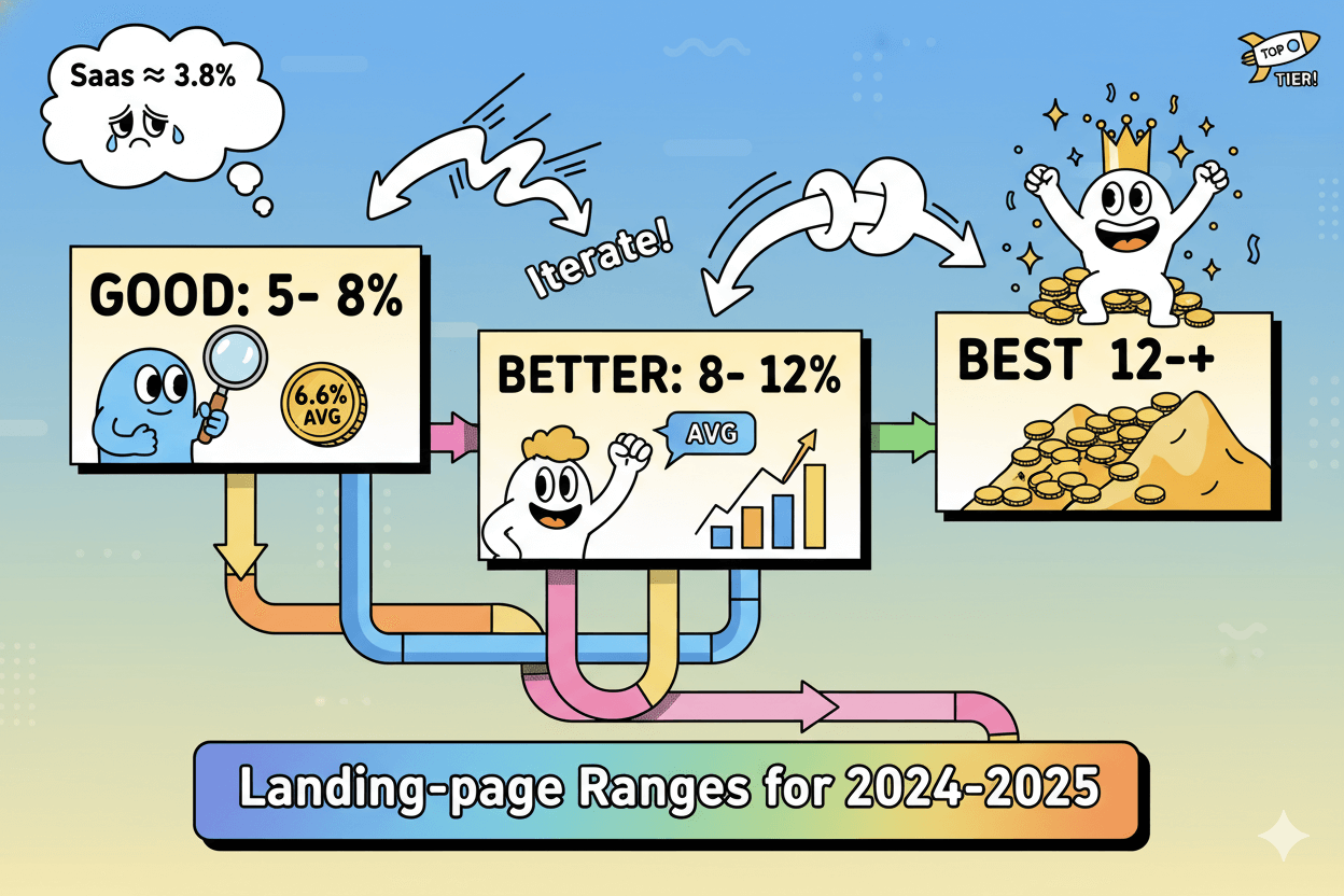
A practical starting goal for general SMB opt-ins is 6–8%, built on Unbounce’s all-industry landing-page median ≈ 6.6% from a large dataset. Treat this as a baseline to beat as you iterate.
Category medians can sit above or below that baseline; for example, SaaS ≈ 3.8%, which is about 42% lower than the all-industry figure. Use percentiles to frame progress and avoid false alarms when your niche converts differently.
Good / Better / Best
- Good: 5–8% opt-in for broad SMB traffic (near the cross-industry median).
- Better: 8–12% as you tighten message-market fit and page clarity.
- Best: 12%+ when you’re operating near top quartile for your category and traffic quality.
Email engagement: CTR, CTOR, and why opens mislead
For weekly decision-making, track click-through rate (CTR) first. MailerLite’s 2025 benchmark shows an average CTR of 2.00% across millions of campaigns, with industries ranging roughly 0.77%–4.36%.
That same guide notes privacy changes make opens noisy, so clicks are the cleaner engagement signal today.
Mailchimp’s live benchmarks also report CTR and break out performance by industry, which helps you set more precise expectations as your list grows.
Good / Better / Best
- Good: ~1–2% CTR on early lists.
- Better: 2–3% CTR with stronger segmentation and clearer CTAs.
- Best: 3%+ CTR in well-aligned niches and higher-intent segments.
Mobile vs desktop: design for where people convert
Most landing-page visits happen on phones, yet desktop often converts better. Unbounce reports ~83% of visits on mobile while desktop converts about 8% better on average.
This doesn’t mean mobile can’t win; it means small, specific fixes on mobile layouts have outsized impact. Keep copy tight, forms short, images compressed, and buttons thumb-friendly… then watch your device split trend.
myth_buster: “If my mobile traffic is huge, my mobile conversions must be higher.” Not necessarily.
Use device-level reporting to see where the drop happens and fix the experience where people struggle, not where you wish they converted.
Conclusion
You’ve got a clear path now: one page, one magnet, one easy-yes offer, two metrics you watch every week. Keep your language simple, your pages fast, and your promises specific.
When you feel the urge to add complexity, return to the basics: guide a stranger from awareness to action with the fewest possible steps. Standard definitions exist to keep your team aligned while you test and learn.
Set targets you believe. Use ~6–8% as your first opt-in goal because it sits on top of a large cross-industry 6.6% median measured across tens of thousands of landing pages. If your category runs lower or higher, adjust.
Aim for your median first, then reach for the 75th percentile with small, readable experiments.
In your emails, focus on what moves people, not vanity numbers. Click-through rate is a cleaner, privacy-resilient engagement signal in 2025.
A broad multi-industry read shows ~2.0% average CTR, with meaningful spread by niche. Track your own baseline for two to four weeks, then iterate your subject lines, offers, and calls to action with one lever at a time. – Mailerlite
Your next seven days are straightforward.
- Day 1 choose your magnet.
- Day 2 build the page.
- Day 3 wire the thank-you and the first email.
- Day 4 publish the starter offer.
- Day 5 test one change.
- Day 6 review opt-ins and clicks.
- Day 7 decide the next tiny lever.
Add volume only when those two numbers hold or rise under pressure. If you include affiliate links, disclose clearly near the first link. Keep it honest, keep it simple, and keep shipping.

School Of Money: Landing Page to Payday


