PageBuilder gG: Build Websites & Landing pages That Load Fast With consistent style
You want landing pages that feel premium the moment they load. This post focuses on simple steps that help your pages stay consistent while you publish and improve over time. You’ll get a clean landing-page skeleton you can copy and adapt for any offer. You’ll also learn a light “publish, measure, improve” rhythm that keeps momentum steady.
Friend to friend: a few links are affiliate links. When you purchase, I might get a tiny thank-you from the company, with zero added cost to you. I only recommend things that I’ve actually tried and looked into. Nothing here is financial advice; it is for entertainment. Read the full affiliate disclosure and privacy policy.
You’re building a website on a tiny team, with a real business on the line. You want AI to give you a strong first draft, and you want your site to stay consistent when you add pages, offers, and updates.
This guide shows what PageBuilder.gg is positioned to do, how “intelligent design” stays coherent, and how it compares with Lovable’s GitHub export path.
This guide shows you how to think about PageBuilder.gg as a Lovable alternative, using the facts we can verify publicly today.
PageBuilder.gg is marketed as an AI-assisted website builder with an in-browser code editor and live preview, plus “intelligent design tools.”
Lovable positions itself as a natural-language platform for building full-stack web apps, and it documents exporting your code via GitHub.
Here’s what you’ll walk away with:
- A prompt-to-site workflow you can reuse whenever you launch something new
- A simple “pages vs apps” decision rule for PageBuilder.gg vs Lovable
- A calm checklist for ownership, performance, and SEO basics you can keep improving over time
What is PageBuilder.gg, and who is it for?
If you’ve ever opened a builder and wished the page could “click” into place faster… this is your section. PageBuilder.gg is marketed as AI-powered assistance paired with an in-browser code editor and live preview.
That mix points to speed plus control for founders, creators, and small teams building marketing pages.
The plain-English definition
PageBuilder.gg is presented as a way to build website pages with help from AI, while still giving you hands-on control in an editor. Its homepage highlights AI assistance, a Monaco code editor, live preview, and “intelligent design tools.”
In ScaleGG’s own social messaging, the positioning leans toward faster creation of “high-impact pages,” framed as “GroovePages + AI.”
That combination points to a practical audience: founders, creators, and small business owners who want speed plus control. You want the AI to draft the structure, then you want to shape it so it sounds like you and looks like your brand.
What you see on-screen while building
Based on PageBuilder.gg’s public description, expect a build flow that centers on editing and previewing together.
The homepage calls out a Monaco code editor and live preview, which implies a tighter feedback loop: change something, see it, adjust again.
You can also borrow a helpful expectation from mainstream AI site builders: generate first, then refine. Wix describes a chat-to-site flow followed by refinement of theme, layout, images, and text.
That generation-and-refinement rhythm is a simple mental model to use when you evaluate any AI builder.
Best-fit use cases for marketers and local businesses
This is where the tool choice gets easy. A page-focused AI builder shines when you care about:
- A clear offer and one main action, like booking, calling, or requesting a quote
- Campaign pages that you publish quickly and iterate weekly
- Creator pages that need consistent design across new launches
Quick win: Pick one “hero promise” sentence and one proof element before you build. Your hero promise is the big outcome. Your proof is a review, a result, or a simple credential. That pairing makes AI drafts cleaner, and your edits faster.

Intelligent design… the consistency engine your future self will thank you for
The best-looking sites feel consistent, page after page. “Intelligent design” is the set of guardrails that keeps fonts, spacing, and section patterns working together while you build.
Major builders describe generate-first, refine-fast workflows, which makes consistency the real superpower.
A site feels professional when every page looks like it belongs to the same brand. That’s why “intelligent design” matters.
In plain English, it’s the set of guardrails that keep fonts, colors, spacing, and section patterns consistent while you build and iterate. – Wix
Here’s a grounded way to define it using the broader market. Wix describes generating a site and then refining theme and layout.
Squarespace frames its AI builder around “Design Intelligence” and highlights responsive output. The practical takeaway is consistency plus fast refinement.
What “intelligent design” means in plain English
Think of your site like a wardrobe. When everything matches, getting dressed feels effortless. Intelligent design aims to do that for your pages: fewer random one-off choices, more repeatable patterns.
In practice, it looks like:
- A small set of typography styles used everywhere
- A consistent button style for primary actions
- The same spacing rhythm between sections
- A predictable layout pattern for testimonials, pricing, and FAQs
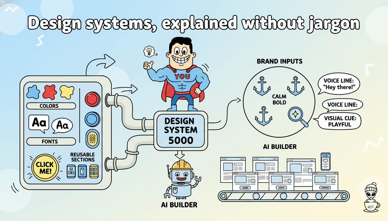
Design systems, explained without jargon
You can keep this simple. You only need one idea: repeat what works.
A “design system” can be as simple as:
- A handful of colors
- Two fonts
- One main button style
- A few reusable sections you repeat across pages
Webflow’s AI builder description emphasizes producing a professional site with layout, images, and copy, which aligns with the idea that the system is created early and then reused as you build more pages.
Brand inputs that make AI feel personal
AI gets sharper when your inputs get clearer. You can help any builder by writing down three brand anchors:
- Three brand adjectives: calm, bold, friendly
- One “voice line”: how you want to sound
- One visual cue: minimalist, colorful, luxury, playful
ScaleGG’s messaging around PageBuilder.gg frames it as a speed tool for entrepreneurs building marketing pages, so these anchors keep that speed aligned with your identity.
From prompt to multi-page site… a workflow you can repeat in one sitting
A good prompt gives you momentum, and a repeatable workflow keeps momentum. Many AI website builders generate a full first draft from your description, then you refine layout, theme, and copy.
This section gives you a prompt template and a fast consistency pass that works for US, UK, and Spanish-speaking audiences.
The real magic is repeatability. You want a workflow you can run on Monday, then run again next month with a new offer… and still get pages that look consistent.
Your 5 inputs, before you type a single prompt
Bring these five things to the page, written in one paragraph each:
- Audience: who you help
- Offer: what you sell
- Outcome: what changes for them
- Proof: why trust you
- Action: what they should do next
This aligns with how mainstream builders expect you to think. Wix’s AI flow centers on describing what you want, then refining the output.

A prompt template you can copy and reuse
Copy this and fill the brackets:
“Create a [number]-page website for a [business type] serving [audience]. Pages: Home, Services, About, Contact, and a Landing Page for [offer].
Brand style: [3 adjectives].
Tone: friendly and clear. Each page should include: headline, short intro, 3 benefit bullets, proof section, and one clear call-to-action: [CTA].
Use consistent section styling across all pages.”
Hostinger’s AI builder describes a simple “describe purpose” step as the starting point, which makes this style of prompt a practical fit.
Build the core pages first, then refine
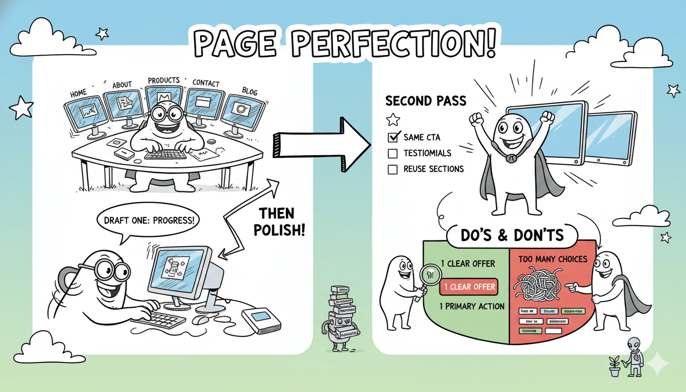
Create your five pages as a first draft. Then do a second pass with a single goal: consistency.
Second-pass checklist:
- Make the same CTA button text appear on every page
- Use the same testimonial format everywhere
- Reuse one pricing or “how it works” section across pages
Do’s and don’ts callout:
Do write your offer in one clear sentence.
Do choose one primary action.
Do reuse sections that already look right.
Aim for progress on draft one, then polish.
GEO mini-playbook: prompt examples by region
Region-specific language makes trust feel natural.
- US local services: include service areas, reviews, and “request a quote” wording.
- UK trades: include accreditations and “get a free estimate” phrasing.
- Spanish-speaking LATAM: include WhatsApp-first CTA language, like “Escríbenos por WhatsApp.”
Keep these as prompt add-ons, so your site drafts feel locally fluent from the start.
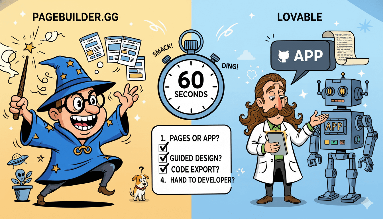
PageBuilder.gg vs Lovable… how to choose in 60 seconds
Tool choices get easier when the decision rule is simple. PageBuilder.gg is positioned around faster page creation with design guidance, and Lovable positions around full-stack app building with a documented GitHub export path.
This section turns that into a clean “pages vs apps” choice you can make quickly.
You want a tool that matches what you are building, and then makes editing feel smooth.
Lovable positions itself as a natural-language platform for creating full-stack experiences from natural language, and it documents exporting your code via GitHub.
PageBuilder.gg positions around AI assistance plus an editor workflow with “intelligent design tools.”
If your priority is landing pages and campaigns
Choose the builder that makes iteration feel light. Marketing pages benefit from fast edits, consistent sections, and quick publishing. PageBuilder.gg’s public positioning leans toward “high-impact pages faster,” which matches that rhythm.

If your priority is product-style building and integrations
If you want a workflow that feels like building an app, the framing around Lovable fits. Lovable’s docs describe creating full-stack experiences from natural language, with the option to keep your code synced to GitHub.
Code ownership, explained simply
Ownership becomes real when you can move your project and keep building without starting over. Lovable explicitly documents exporting your project code via GitHub sync and transfer, plus an FAQ that confirms the export path.
The 60-second decision checklist
Answer these four questions:
- Do I need pages, or a full app workflow?
- Do I want a guided design experience that keeps pages consistent?
- Do I want a documented code export path via GitHub?
- Do I plan to hand this to a developer later?
Export, ownership, and “can I take my site with me later?”
Ownership feels calm when it’s clear early. Public sources used here do not clearly document PageBuilder.gg export options, so this section gives you a simple verification checklist.
Lovable documents exporting via GitHub sync and transfer, which provides a clear reference point for portability.
A smart build today also supports your future plans. Ownership is about options: backups, handoff, migration, and long-term flexibility.
Right now, the publicly captured sources used for this draft do not clearly document PageBuilder.gg export options. That makes export a verification step before you commit to any builder choice.
Lovable provides a clear model here, since its docs and FAQ describe exporting your project by syncing or transferring to GitHub.
The three kinds of “export” people mean
When someone says “export,” they usually mean one of these:
- Design or template export: reuse sections or page templates across projects
- Site files export: download site files for hosting elsewhere
- Code repo sync: push the project to GitHub for versioning and collaboration
Choose the kind you need, then evaluate tools through that lens.

A simple checklist to verify inside PageBuilder.gg
Before you buy, look for a few signals:
- A documented “export” or “download” option in settings
- Clear language about hosting and publishing
- A mention of GitHub, repositories, or version history
- A support article that explains what you can take with you
This section stays calm by design. Clarity is the win here.
Backups and handoff… the calm way to scale
Even if you never export code, you can build a simple ownership habit:
- Keep your brand assets in one folder
- Save your best sections as reusable blocks or templates, when available
- Maintain a copy of key page copy in a document
Pro tip: Pick one place for your “source of truth” copy, like your Home page headline, your offer paragraph, and your testimonials. Update that first, then paste into your builder.
Landing pages that feel consistent and load fast
Speed is part of trust, especially on landing pages. Lighthouse is a standard tool for auditing performance after you publish, and Google’s guidance on page experience and Core Web Vitals supports building for a strong user experience.
This section gives you a landing page skeleton plus a simple measure-and-improve loop.
When a page loads quickly and looks polished, trust rises… and action feels easier.
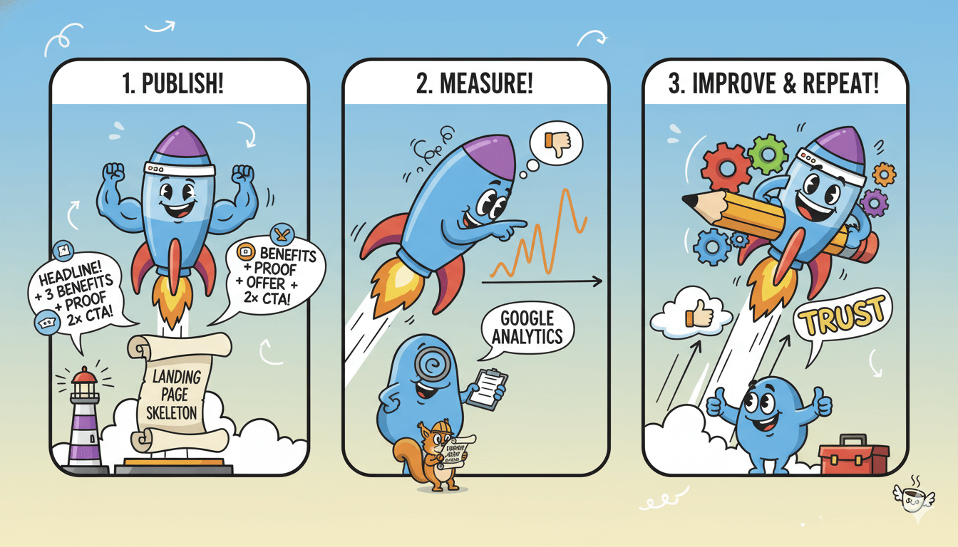
You can keep performance simple. Use one loop: publish, measure, improve, repeat. Lighthouse is a standard tool for auditing performance and quality checks after publishing.
Google also provides documentation around page experience and Core Web Vitals in the context of search results.
A high-converting landing page skeleton
Use this structure:
- Headline with a clear outcome
- Short “why this matters” intro
- Three benefits
- Proof, like reviews or results
- Offer details
- CTA
- FAQ
- Final CTA
This is friendly to AI builders because it’s predictable. The AI can draft it, and you can refine it quickly.
Speed basics that keep pages feeling instant
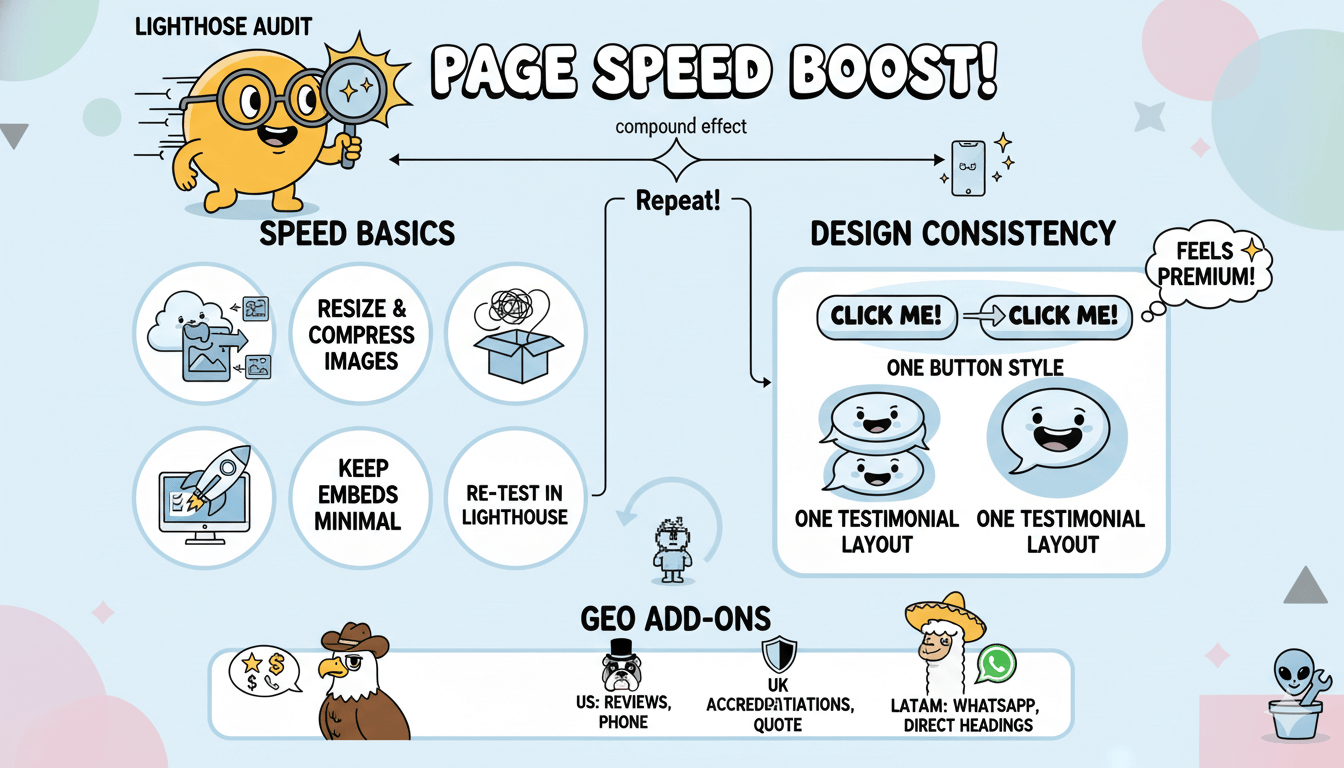
Lighthouse is designed to measure performance and related quality checks, and Google’s guidance on page experience and Core Web Vitals supports building for a strong user experience.
Small improvements compound when you repeat the audit loop.
Practical moves that help most pages:
- Resize and compress images before upload
- Keep embeds minimal and purposeful
- Re-test in Lighthouse after each round of edits
Design consistency moves that make pages feel premium
Choose one button style for primary actions. Choose one testimonial layout. Repeat them across every landing page. That repetition is a shortcut to “premium.”
GEO add-ons: trust signals by market
- US: add reviews, service areas, and a clear phone or booking option
- UK: add accreditations and a clear “get a quote” flow
- Spanish-speaking LATAM: include WhatsApp-first CTAs and simple, direct headings
SEO and accessibility… quick checks that compound over time
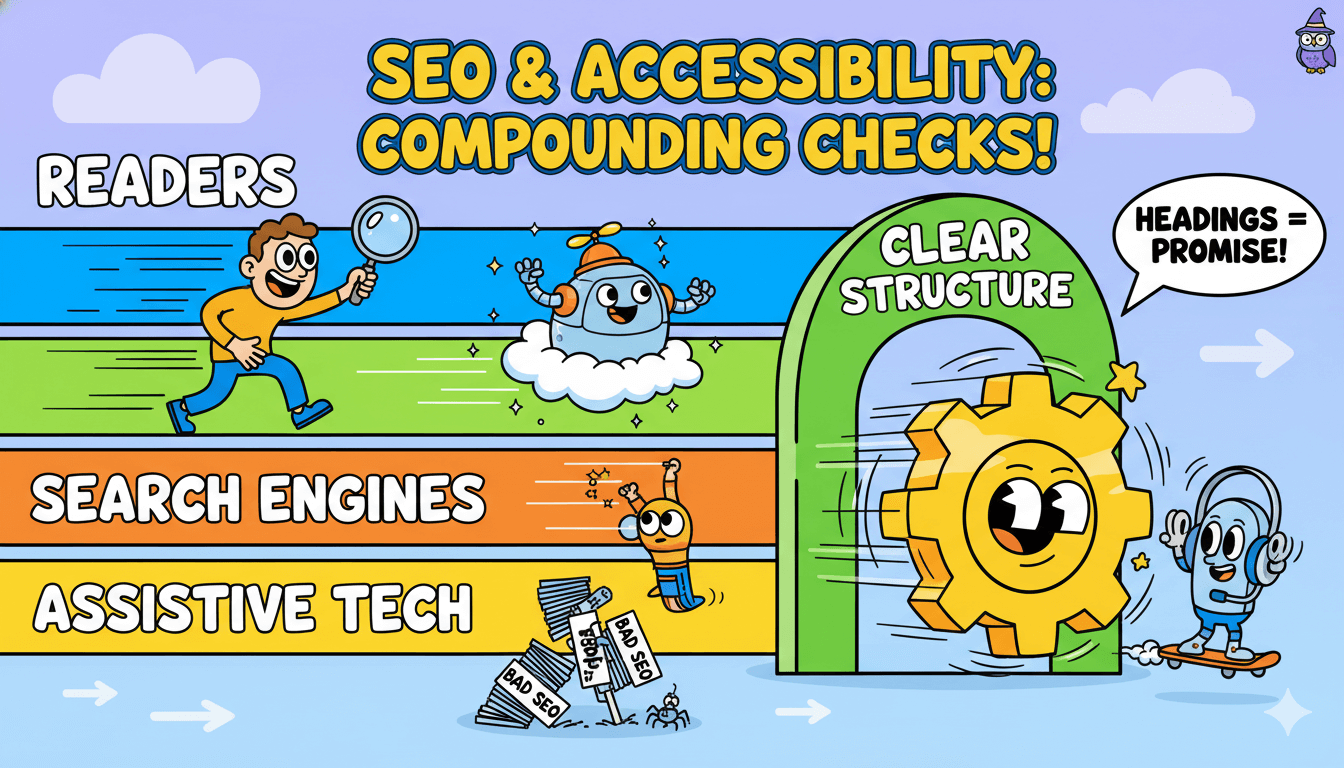
Clear structure helps readers, search, and assistive tech all at once. Headings that match your page structure make content easier to scan and easier to navigate.
This section gives you the quick checks that keep your pages understandable, shareable, and easy to expand.
SEO becomes simpler when your page structure is clear. Accessibility becomes simpler for the same reason. A clean heading hierarchy helps people scan, and it helps assistive technologies navigate. – Squarespace
W3C’s WAI guidance explains headings as part of accessible page structure.
Titles that match what people search
Your title is a promise. Make it literal.
Examples:
- “Lawn Care in Austin: Weekly and One-Time Service”
- “Wedding Photography Packages in London”
- “Diseño web para negocios en Ciudad de México”
Google provides guidance on page experience and searcher experience, so pairing clear titles with fast pages is a practical strategy.
Heading structure that reads like a clean outline
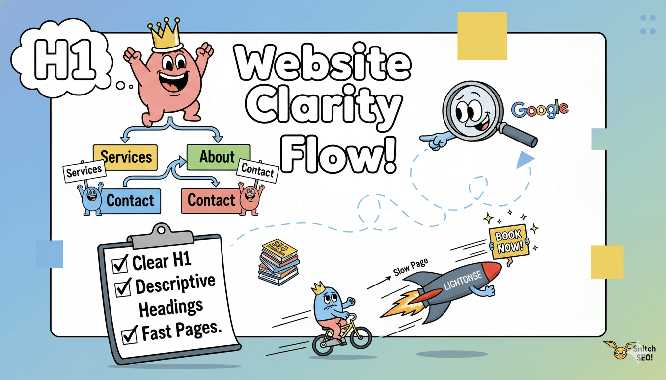
Use headings like a table of contents:
- One H1 for the page topic
- H2s for major sections
- H3s for subpoints
That structure supports accessibility and clarity.
Internal links that guide both readers and Google
Link from your Home page to your core pages: Services, About, Contact, and your most important offer page. Keep link text descriptive, like “View pricing” or “Book a consultation.”
A quick sanity check that helps SEO and clarity at once: read only your H2s and ask if they tell the whole story. If they do, your page is easier to scan… and easier to summarize.
Checklist callout:
- One clear H1
- Descriptive H2s and H3s
- Clear titles
- Fast pages measured with Lighthouse
- Simple internal links that match real user intent
FAQ… quick answers before you choose a builder
Fast decisions come from clear answers. This FAQ gives short, direct responses to the questions people ask most about AI website builders, PageBuilder.gg, Lovable, export, and performance. Keep these answers close when you compare tools and plans.
Can AI build a full website from a prompt?
Many AI website builders can generate a full first draft from a short description or chat, then you refine layout, style, and copy.
Wix describes chatting with AI to generate a custom site and then refining themes, layouts, images, and text. Hostinger describes describing your site’s purpose and generating a complete website.
What is PageBuilder.gg and how does it work?
PageBuilder.gg is marketed as an AI-assisted builder with AI-powered assistance, a Monaco code editor, live preview, and “intelligent design tools.” ScaleGG’s official messaging positions it as “GroovePages + AI” for creating high-impact pages faster.
PageBuilder.gg vs Lovable: which is better for website building?
Choose based on deliverable. PageBuilder.gg is positioned around faster page creation with design guidance. Lovable positions for full-stack web apps and documents exporting your code via GitHub, which supports portability and collaboration.
Can I export my PageBuilder.gg site code?
The publicly captured sources used for this draft do not clearly document PageBuilder.gg export options, so treat export as a verification step. Lovable explicitly documents exporting by syncing or transferring your project to GitHub.
Which AI website builder is best for marketers and landing pages?
The best fit is the one that supports fast iteration after generation and makes refinement easy. Wix describes a workflow where AI generates a site through chat and then you refine theme, layout, images, and text.
Pair that with Lighthouse audits after publishing to keep pages fast.

How is this different from Wix AI, Squarespace Blueprint AI, or Webflow AI?
Wix describes a chat-to-site workflow. Squarespace frames its builder around “Design Intelligence” and highlights responsive output. Webflow describes generating a professional site with layout, images, and copy. These are different flavors of the same core idea: generate a draft, then refine it.
Schema note: If you publish these FAQs, Google provides guidance for marking up FAQs with structured data, and the safest approach is to keep questions real and answers direct.
Conclusion
If you’re choosing an AI website builder, your best move is to match the tool to the deliverable you want.
PageBuilder.gg is publicly positioned around AI assistance, an editor and live preview workflow, and “intelligent design tools” aimed at creating high-impact pages faster.
Lovable is positioned around building full-stack web apps from natural language, and it documents code export through GitHub, which supports portability and collaboration.
Your next best step is simple: write your five inputs, generate a first draft, then do one consistency pass across pages. Publish, run a Lighthouse audit, improve the biggest issues, and repeat… compounding wins.
When portability matters, treat “export” as a decision step, not an afterthought. Use the export checklist in this post, and verify what you can take with you inside the product and its official docs.
Then use the “pages versus apps” decision rule and pick the tool that keeps your momentum steady.
To keep your site easy to grow, keep your structure clean: one clear H1, descriptive H2s and H3s, and repeatable sections you reuse on every new page.
That clarity supports readers, search engines, and answer engines all at once… and it makes your next launch feel lighter than the last.

PageBuilder gg:The perfect Playbook for Small Teams


