Tinyemail: Pocket-Sized Emails, Big Results
Short emails travel further because people actually finish them. We’ll use a tiny stack that fits on one screen and still tells a story. Add one proof point and one offer so it feels honest and helpful. Your click numbers start climbing without extra fluff.
Friend to friend: a few links are affiliate links. When you purchase, I might get a tiny thank-you from the company, with zero added cost to you. I only recommend things that I’ve actually tried and looked into. Nothing here is financial advice; it is for entertainment. Read the full affiliate disclosure and privacy policy.
Build a TinyEmail that respects real inbox limits. Short subject, single column, strong contrast, and a simple timing test get you farther than guesses. Start now and measure in two weeks.
To make this easy, use one repeatable template and a tiny set of rules so each send is faster and clearer for your readers.
Timing matters, but there’s no single magic hour. Recent dataset rollups point to weekday sends performing well, with reliable peaks from late morning through early evening.
Use that as a starting window, then test what your list proves over two weeks.
Design for thumbs first. A single-column layout around 600–640 px stays readable, buttons should be at least 44×44 points, and your color contrast should meet AA so text pops on small screens.
Keep total HTML lean to avoid Gmail’s clipping at roughly 102 KB… your CTA should never hide behind “View entire message.”
Send with this playbook, measure opens and clicks, then repeat what works.
The TinyEmail Newsletter Formula (one screen you can ship today)
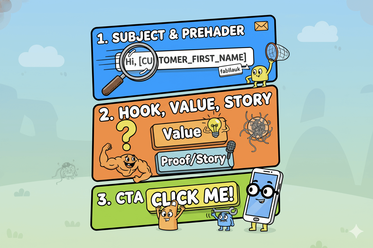
One page, one purpose. Follow this six-block stack and send today. Start with a simple stack that fits how people scan: Subject → Preheader → Hook → Value Block → Proof/Story → CTA.
Keep everything in a single column so it’s easy to read and tap on phones. A 600–640 px width is a durable standard across major clients.
Subject stays short and specific. Mailchimp recommends concise lines and light punctuation, which helps deliverability and display. Preheader extends the promise in 35–90 characters.
Hook sets context in one or two lines. Value Block delivers the tip, offer, or update. Proof/Story anchors trust in 2–4 sentences. Finish with one primary CTA—no competing buttons.
Personalize lightly where it matters. TinyEmail supports merge tags like [CUSTOMER_FIRST_NAME] in subject, preheader, or greeting.
Add a safe fallback so blanks never appear. Pair this with simple segments—new subscribers, recent clickers, lapsed readers—so the same template speaks to different moments without redesign.
TinyEmail provides both custom and predefined segments you can select in the Audience view.
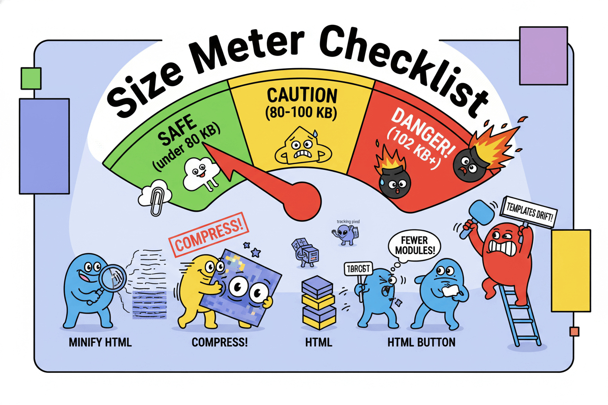
Keep the message fast and unclipped. Gmail truncates emails near 102 KB of HTML, and ESP link-wrapping can inflate size, so target <100 KB HTML and ideally ~80 KB.
Minify code, trim extra modules, and compress imagery. That keeps your CTA visible in the first load and preserves accurate tracking.
Guarantee legibility with accessible contrast and tap targets. Use AA contrast 4.5:1 for body text and 3:1 for large text.
Buttons should meet platform guidance for touch—designers commonly use ≥44×44 points on iOS and ≥48×48 dp on Android.
These specs reduce accidental taps and make your primary action effortless.
quick_win: Duplicate this section order into a TinyEmail template. Add merge tags to the Subject and Greeting with fallbacks, drop one CTA button, and save the template as “Formula – Single Column.” Your next newsletters keep the same frame while content changes.
Template blocks with copy length ranges
- Subject: 40–60 characters; benefit-first phrase. – My Willamette EDU
- Preheader: 35–90 characters; complete the promise.
- Hook: 1–2 lines; situation or outcome.
- Value Block: 50–120 words; the how or the offer.
- Proof/Story: 2–4 sentences; result, testimonial, or micro-case.
- CTA: 2–5 words on the button; one action only. Use a single column at 600–640 px and keep HTML under ~100 KB.
Where each block lives in TinyEmail editor
- Subject & Preheader: Campaign setup; insert
[CUSTOMER_FIRST_NAME]with fallback if desired. - Hook, Value, Proof/Story: Text modules in the content canvas; keep paragraphs short for mobile.
- CTA: Button module near the fold; meet AA contrast and size for touch to reduce friction.
Subject lines that earn opens (short, clear, testable)
Write for display first. Put the promise in the first 40–60 characters.
You’ll get the biggest lift by writing for display first, then testing two clean angles. Most inboxes only show a slice of your line, so put the key words up front and trim the rest.
Aim for roughly 40–60 characters as a working window and keep the language plain.
Keep it human and specific. Describe the benefit, not the hype. Vendor guides converge on similar rules: be descriptive, keep it short, avoid heavy punctuation, and skip shouty caps.
If you use an emoji, use one and only where it clarifies meaning. Many marketers do use emojis, yet the effect is mixed, so treat them as a visual accent you test rather than a default.
Your safest path is to ship simple patterns that fit phones. Several studies and roundups point to concise lines performing well, with visibility dropping as length grows past the mobile preview.
On mobile, many readers only see 30–40 characters, so front-load the promise. Then validate your instinct with a quick A/B: one clear benefit vs one question or curiosity frame. – Github
pro_tip: Pair your subject with a preheader that finishes the thought. Keep the preheader short and concrete so the two read like one sentence in the inbox.

5 plug-and-play subject line patterns
- Benefit first: “Save two hours today” — direct, outcome led.
- Question: “Ready to book more jobs?” — invites a quick yes.
- Numbered promise: “3 ways to fill your calendar” — easy to scan.
- Personalized nudge: “{First name}, your weekly shortcut” — use a safe fallback.
- Time cue: “Last seats for tonight” — urgency, used sparingly and truthfully.
Keep each to ~40–60 characters. If you add an emoji, place it at the end or replace a word that the symbol truly conveys… then test with and without.
A/B setup and success thresholds
Test one variable at a time. When testing subject lines, keep sender name, preheader, content, and timing identical.
Split the audience randomly, send both versions, and read opens alongside click-to-open to ensure the subject’s lift isn’t hiding weaker body copy. Lock the winner and reuse the winning angle in new words the following week.
Start with two angles: Benefit vs Question or Plain vs Emoji. Run the test twice across similar sends to confirm the signal.
For small lists, prioritize big deltas you can actually detect rather than tiny tweaks. Write down your result and move to the next lever. Repeat monthly so your lines evolve with your readers.
Send timing & frequency: a 2-week calibration plan
Stop guessing. Test two weekday windows and keep the winner.
You’ll get farther, faster by testing two clear windows instead of chasing a universal “best time.” Large recent datasets show weekday performance clustered in work hours and early evenings, with middle-of-week days often competitive.
MailerLite’s 2025 analysis highlights weekday peaks between 3–7 p.m. and weekend opens around 7–9 a.m.; Omnisend’s 2024 study finds Tue–Thu with strong checkpoints at 8 a.m., 1 p.m., and 4 p.m.
Use these as your starting tiles, then let your list tell you what wins.
2-week calendar and metrics
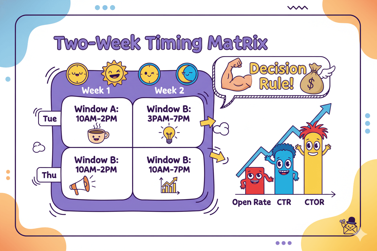
Run a simple A/B over two consecutive weeks. Pick two local-time windows that reflect the evidence and your audience rhythm:
- Window A: mid-day visibility, e.g., 10 a.m.–2 p.m. Tue–Thu. Salesforce frames working hours as a reliable baseline for many audiences.
- Window B: late-day attention, e.g., 3–7 p.m. Tue–Thu, which tracked highest in MailerLite’s study.
Week 1: send A on Tue, B on Thu.
Week 2: swap them. Track Open Rate, CTR, and CTOR. Use CTOR to judge body relevance independent of inbox visibility: CTOR = unique clicks ÷ unique opens × 100
…keep sender, subject framework, and content constant so timing is the only variable.
Decision rule: if one window beats the other by ≥10% relative on opens and is not worse on CTOR, lock it for the next month. If opens tie but one window shows higher CTOR, keep the one with better post-open engagement.
Re-test quarterly because audience routines drift. Omnisend’s multi-billion-send analyses also note that performance can split by goal, with some windows favoring clicks or conversions even if opens are similar. – Email on Acid
Frequency rules for small lists
Start with a cadence you can sustain and your audience will welcome.
Practical guidance from industry roundups: at least monthly and no more than twice a week for newsletters, with many teams landing on weekly or biweekly while they build muscle.
Monitor unsubscribes, complaint rate, opens, CTR, and CTOR; if engagement slips or churn rises, reduce cadence or tighten segmentation.
Creators and small teams often underestimate production time; plan 2–4 hours per send end-to-end so quality doesn’t fall as you increase frequency.
If resources are tight, choose biweekly and make every edition count before you scale to weekly. Re-evaluate cadence after four sends using your best-performing window.
If weekend audiences matter for you, test a 7–9 a.m. weekend send as a separate experiment once you’ve locked a weekday window; MailerLite’s 2025 data shows promise there, but volume is lower, so validate with your own metrics.
Mobile-first, accessible design that boosts real clicks
Design for thumbs. One column, clear contrast, big buttons.
Phones do the heavy lifting, so design for fast scanning and easy tapping. Keep a single column so the eye moves in one direction and the layout doesn’t break on small screens.
A total width around 600–640 px remains a durable standard across major clients and templates. Pair that with readable type and a clear visual hierarchy so the primary CTA is obvious at a glance.
Make every pixel work for everyone. Meet WCAG AA contrast: 4.5:1 for normal text and 3:1 for large text so words stay legible against backgrounds.
Apple’s guidance sets a minimum hit target of 44×44 points, while Android/Material recommends ≥48×48 dp (about 9 mm). Buttons that meet these sizes reduce mis-taps and lift real-world click-through because thumbs have room to land.
Keep the HTML lean so nothing important disappears. Gmail clips messages when the HTML crosses ~102 KB, hiding the rest behind “View entire message.”
Because tracking and link-wrapping can add extra weight, aim <100 KB—ideally ~80 KB—and compress images. This prevents missing CTAs and preserves analytics. –DequeUniversity
do’s_and_don’ts
- Do use one primary CTA above the fold with a clear label.
- Do give images alt text that describes purpose, not decoration.
- Don’t stack tiny links; group actions into one button that meets platform target sizes.
- Don’t rely on color alone to signal state; pair it with an icon or text.
The 10-point mobile checklist
- Layout: single column; keep total width ~600–640 px.
- Body text: comfortable size with generous line-height; keep paragraphs short.
- Contrast: meet 4.5:1 (AA) for body text; 3:1 for large text.
- Buttons: ≥44×44 pt (iOS) or ≥48×48 dp (Android); space them apart.
- CTA copy: 2–5 words, action-led; one primary action.
- Images: compress and add alt text; avoid text-heavy images.
- Links: descriptive text that explains the destination.
- Preheader: short and supportive of the subject line.
- Weight: keep HTML <100 KB; budget ~80 KB to avoid clipping.
- Test: preview on common clients and actual phones before sending.
Before/after layout wireframes
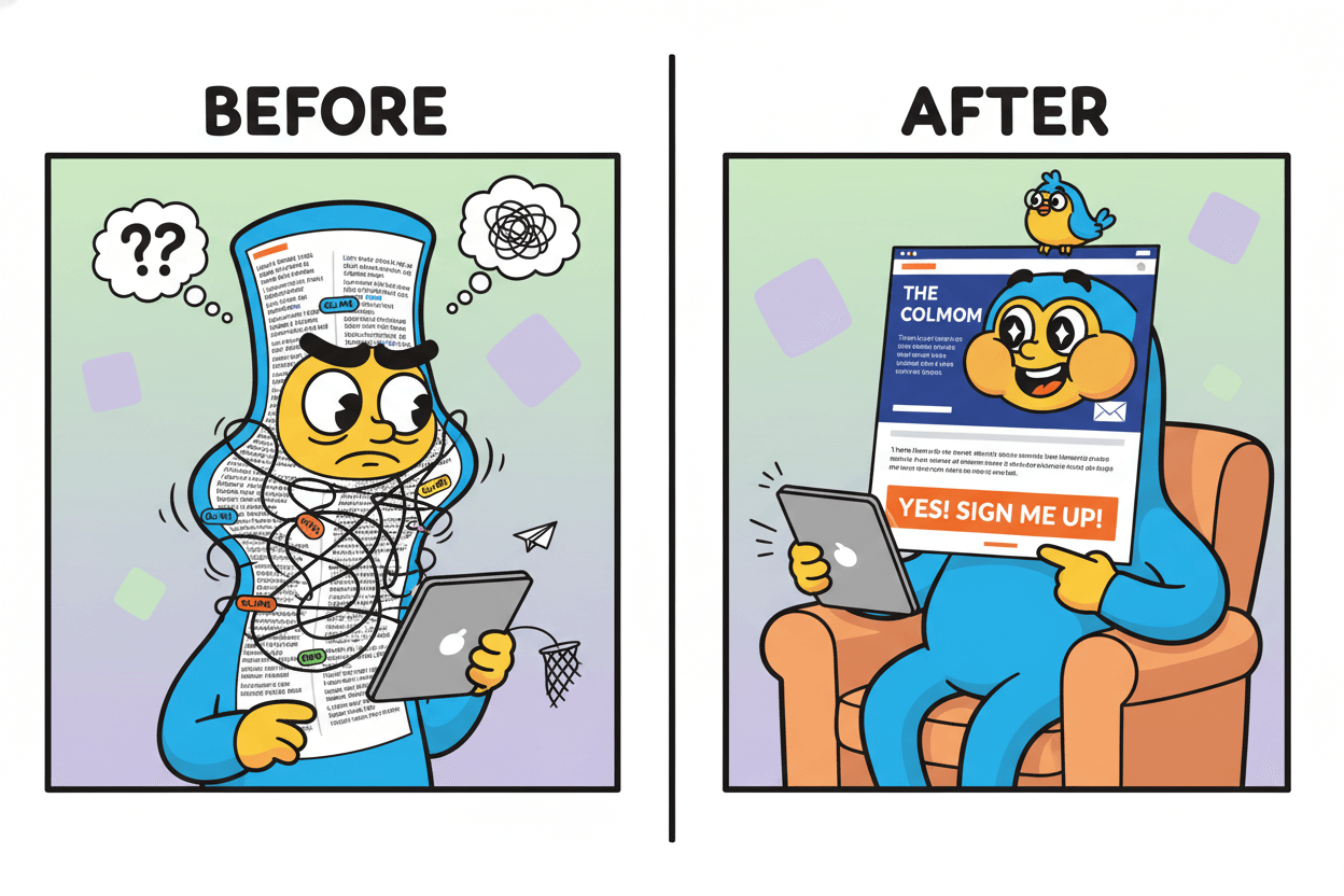
- Before: two narrow columns, small links, low-contrast text, multiple CTAs competing.
- After: single column with clear sections, AA contrast text on solid background, one full-width CTA sized to platform targets, concise copy, and generous spacing.
Avoid clipping: size and weight guardrails that protect deliverability
Keep HTML under ~100 KB so nothing important disappears.
If Gmail clips your email, readers miss the good part. Gmail truncates messages when the HTML source crosses about 102 KB and hides the rest behind “Message clipped” with a “View entire message” link.
Your tracking and link-wrapping can add extra weight after you hit send, so aim lower than the ceiling. A practical target is <100 KB, with ~80 KB as a comfortable safety band.
The threshold is real, yet not perfectly consistent. Practitioner testing shows clipping can appear a bit under the 102 KB mark, and community threads confirm variability across clients and scenarios.
That’s why the safest play is to ship lean code, verify size pre-send, and keep a buffer for ESP modifications.
The under-100 KB checklist
- Minify HTML and strip unused CSS. Inline only what’s required for key clients.
- Reduce modules: fewer sections, fewer nested tables, fewer spacer blocks; use padding for whitespace.
- Simplify buttons: build as styled HTML, not image slices.
- Compress images and GIFs; prefer modern formats where supported, and keep dimensions honest. – Beehiiv
- Limit tracking where possible; every extra link adds markup.
- Audit before send in a pre-flight tool or DevTools to confirm final HTML size under ~80–100 KB.
- Retest after edits; small content changes can tip you over the line.
- Watch templates over time; components drift larger as teams add blocks.
Troubleshooting clipped emails
If you see “Message clipped,” open the web-view to confirm what was cut, then reduce HTML weight until the in-inbox view shows complete.
Start with code bloat: remove duplicate CSS, collapse nested tables, and merge adjacent text blocks. Replace spacer images and line-break “stacks” with module padding.
If your HTML sits just under 102 KB but still clips, assume post-processing pushed it over. ESPs often rewrite links and inject tracking pixels, increasing final size.
Cut a little more or remove a nonessential block, then resend the test. Some vendor docs and practitioner logs also note platform-specific quirks and occasional clipping below the nominal limit, which reinforces using a margin.
For teams that send image-heavy promotions, keep the HTML lean even if images are hosted externally; the HTML still governs clipping.
Combine these guardrails with your mobile-first layout and you protect both visibility and measurement on every send.
Personalization & segmentation without overkill
Merge tags with fallbacks; three simple segments.
Start small and useful. Use personalization where it adds clarity or warmth, not as decoration. TinyEmail gives you the essentials: merge tags to drop a first name or city, and segments to target by behavior or profile.
Add a safe fallback so blanks never show, then send each segment a single clear offer that matches where they are today.
Personalization works best when it truly matches intent. Industry roundups often report lifts for personalized subject lines, yet the real effect varies by list and context.
Treat every claim as a starting hypothesis and run simple tests in TinyEmail: two subject angles, same send time, clean split. Keep what wins and reuse the angle, not the exact words.
Segmentation multiplies relevance without redesigning your template. Begin with three lightweight groups you can maintain in minutes each week, then expand only if you see clear gains.
3 starter segments and offers
- New subscribers (first 14–30 days): Send a short welcome, your top resource, and a gentle invite to your core offer. Track CTOR to confirm the body is working, not just the subject. Build as a predefined or custom segment, then reuse.
- Recent clickers (last 30–45 days): Follow up with a related tip or limited bonus. Keep design identical so the only change is message-market fit. Use TinyEmail’s behavior filters to define the window.
- Lapsed readers (60–90 days no opens): Send a gentle “still want this?” edition with one strong benefit and a stay-subscribed button. If they don’t engage, reduce frequency or sunset gracefully using a saved segment.
micro_challenge: This month, run one test per segment: First-name subject vs neutral, or Benefit vs Question. Split the segment evenly, keep content and time identical
…and read both open rate and click-to-open before you lock the winner. TinyEmail supports A/B tests for subject, sender, or content, so you can iterate fast.

Where to place merge tags in TinyEmail
- Subject & preheader: Insert a first-name tag with a fallback so casual lists never show blanks. Keep it light and natural. TinyEmail’s Merge Tags guide shows the exact syntax and placement.
- Greeting and sign-off: Use the same tag in the opening line. If your tone is friendly, a simple “Hi {First name}” is enough.
- Dynamic details in the body: If you store fields like city or product category, reference one detail to tighten relevance. Keep the template single-column so the only moving part is the text. Define or reuse the audience via Predefined or Custom segments in the Audience view.
Personalization isn’t a magic switch… it’s a learning loop. Use it to be specific, then let your segments and A/B tests decide what stays.
Measure, learn, repeat: TinyEmail A/B basics
One variable. Same time. Clear rule.
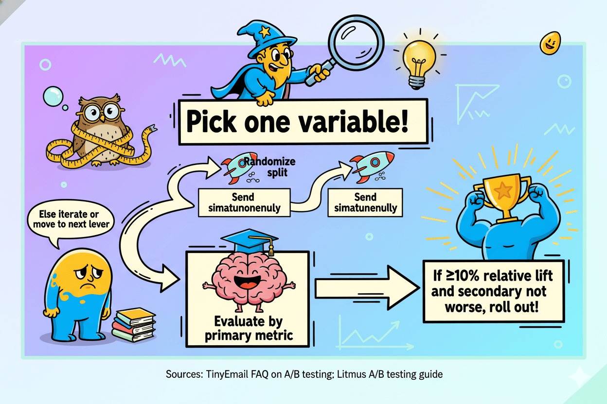
Small, focused tests stack results. Pick one variable, split your list evenly, and keep everything else identical. TinyEmail supports A/B tests on subject lines, sender names, and content, so you can learn fast without switching tools.
Plan the test, send both versions at the same time, and decide with clear rules you set before you start.
Explain success in plain numbers. Track Open Rate to see inbox pull, CTR to see total clicking, and CTOR to see how well the body converts people who already opened. CTR is clicks divided by delivered; CTOR is clicks divided by opens.
Read them together: if a subject boosts opens but CTOR drops, the body may not match the promise.
Start with the highest-leverage variables in order: subject line → send window → CTA text. For each, run two sends across similar audiences at the same time.
Keep samples randomized and equal. Choose a practical decision rule such as “declare a winner if the leader beats the other by ≥10% relative on the primary metric and is not worse on the secondary metric.”
Log the outcome and reuse the winning angle, not the exact words, on the next campaigns.
myth_buster: Testing three things at once is not faster. When you change multiple elements, you cannot attribute the lift. One variable per test keeps conclusions clean and repeatable.
Pick your first two tests
- Subject line: Write two distinct angles, like Benefit vs Question. Send both at the same time to randomized halves. Judge primarily by Open Rate, then sanity-check CTOR so you don’t reward clickbait.
Lock the winner for 4–6 weeks before you iterate. TinyEmail’s A/B feature handles this flow inside the campaign setup. - Send window: After a week or two of subject tests, hold the subject constant and test two time windows that match recent benchmarks for your audience.
Decide by Open Rate first, keep the window that wins without harming CTOR, then re-test quarterly.
Reading results and rolling out
Measure what changed and why it likely changed.
If the subject line A beats B on opens and both versions have similar CTOR, ship more lines in A’s style. If timing B lifts opens but CTOR falls, the audience may be distracted at that hour; keep A.
When a variable shows no meaningful difference, stop testing it and move to the next lever. Keep a simple log with date, audience size, variable, metric deltas, and the final decision.
Over time, this journal becomes your private benchmark library.
Conclusion
Here’s your next move set so you can send with confidence and learn fast. First, write two clean subject lines and keep them tight so they display well on phones.
Aim for about 40–60 characters, avoid shouty punctuation, and use at most one emoji if it truly adds meaning.
Second, lock a two-week timing experiment. Test one midday window and one late-day window on the same weekdays, then keep the winner for the next month.
Re-test quarterly so you follow your audience instead of generic “best time” claims.
Third, ship a single-column layout that feels effortless on thumbs. Keep total width around 600–640 px, meet AA contrast so text pops, and size your primary button to at least 44×44 points on iOS or 48×48 dp on Android.
These small specs reduce mis-taps and lift real clicks.
Fourth, protect visibility and measurement by keeping your HTML light.
Gmail clips messages once the HTML crosses roughly 102 KB, so budget under that ceiling and leave headroom for tracking; many practitioners target ~80 KB to stay safe. Compress images, trim extra modules, and minify before send.
Fifth, personalize with restraint and segment where it matters. Add a first-name tag with a fallback, then send one clear offer to each segment.
Validate with simple A/B tests inside TinyEmail, reading opens for inbox pull and CTOR for post-open relevance. Roll forward only what your data proves.
Run this loop for four sends. You’ll exit guesswork, keep readers comfortable on mobile, and earn more real clicks—without bloating your workflow.

Tinyemail: The Simple Template Your Readers Love


